Nested Layouts Are a Game Changer
Trying to build a decent layout in the Funnel Builder used to be a pain. You wanted a clean, responsive page design. What you got was a mess of margins, columns that didn’t line up, and sections that broke on mobile.
That’s over.
GoHighLevel just rolled out Nested Containers—and they actually fix the problem. You can now stack layout containers inside each other, giving you real control over how your page looks and feels.
Want two columns? Done. Need a pricing table with clean rows and buttons that align? No hacks needed. It’s all drag-and-drop now—and yes, it holds up across devices. This is responsive page design the way it should’ve always been. It’s not flashy. It’s just solid, practical, and overdue.
Real Layout Control, Finally
If you’ve ever wrestled with layout containers in the Funnel Builder, you know the struggle. Getting a responsive page design that actually looks right used to mean extra time, extra clicks, and a few layout hacks.
Now? You can do it all in one place—with full control.
Here’s what’s new:
Automate marketing, manage leads, and grow faster with GoHighLevel.

- Containers inside containers – Nest layout containers any way you want. Drop rows into columns, stack sections, and build layouts that actually match your vision.
- Change direction in real time – Switch from row to column or collage without rebuilding anything. Tweak it on the fly and keep moving.
- Precise spacing and alignment – Set margins, padding, and alignment at each level. No more guessing—just clean, responsive page design that looks good everywhere.
- Save your layout structures – Once you’ve got it dialed in, save the layout and reuse it. Clean builds. Less time. Fewer headaches.
This update is about making things easier and more flexible—so your builds don’t break when screens shrink and your layout doesn’t fall apart when you make a change.
How to Use Nested Containers
Nested containers sound fancy, but using them is actually simple. If you’ve been trying to create a responsive page design that works across devices—without wrestling the layout into place—this will save you time and stress.
You’re basically stacking building blocks. Drop containers inside other containers, line things up the way you want, and tweak spacing without touching a line of code. Whether you’re building a two-column opt-in page or a pricing grid, this setup makes it cleaner and easier.
Here’s how to start using nested containers in the Funnel and Website Builder:
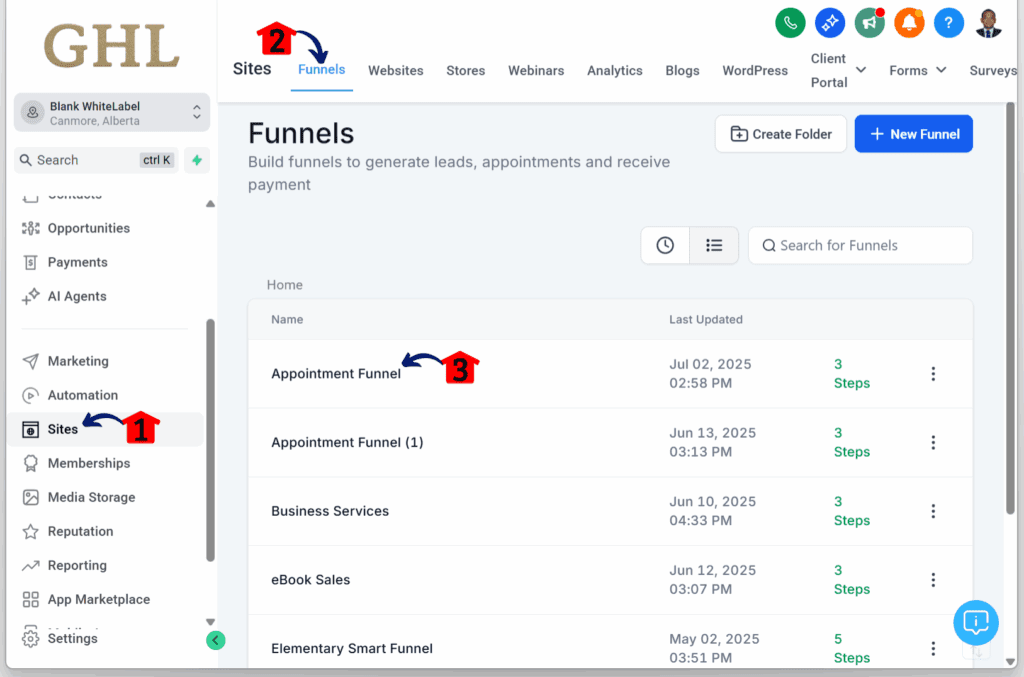
Step 01 – Access the Main Left Hand Menu in GoHighLevel
- The Main Menu on the Left side of your screen has all the main areas that you work in when using GHL
1.1 Click on the Sites Menu Item.
- Access the Sites section of GoHighLevel
- You’ll now be in the Sites section of GHL, where you can access the Funnels section from the top menu:
1.2 Click the Funnels tab.
- We’re using Funnels as the example in this walkthrough.
1.3 Click any existing funnel.
Step 02 – Open the Funnel Step Editor
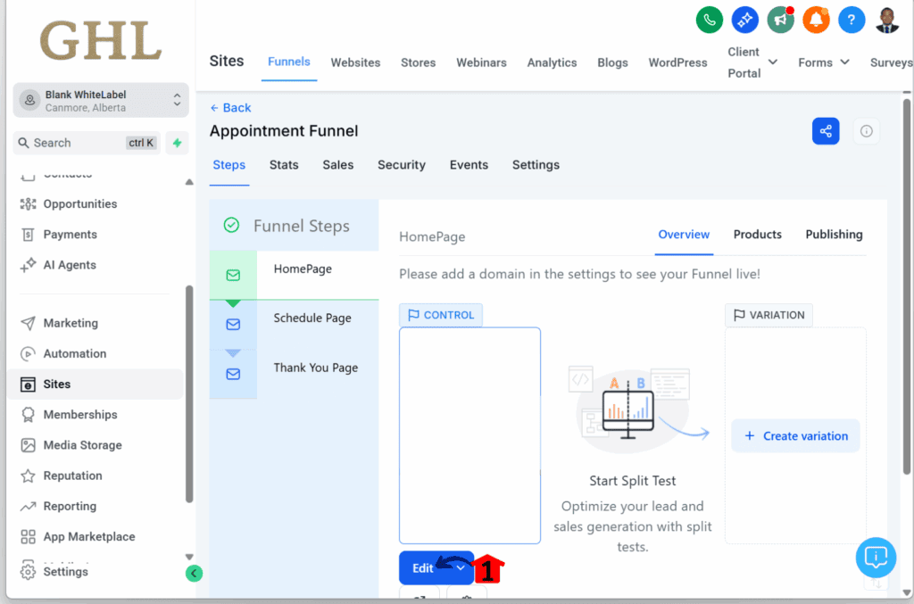
- You’ll now be taken to the dashboard of the selected funnel.
2.1 Click the Edit button on any funnel step.
- For this guide, we’re using the first step as the example.
Step 03 – Review the Funnel Canvas
- You’ll now be taken to the web builder/editor.
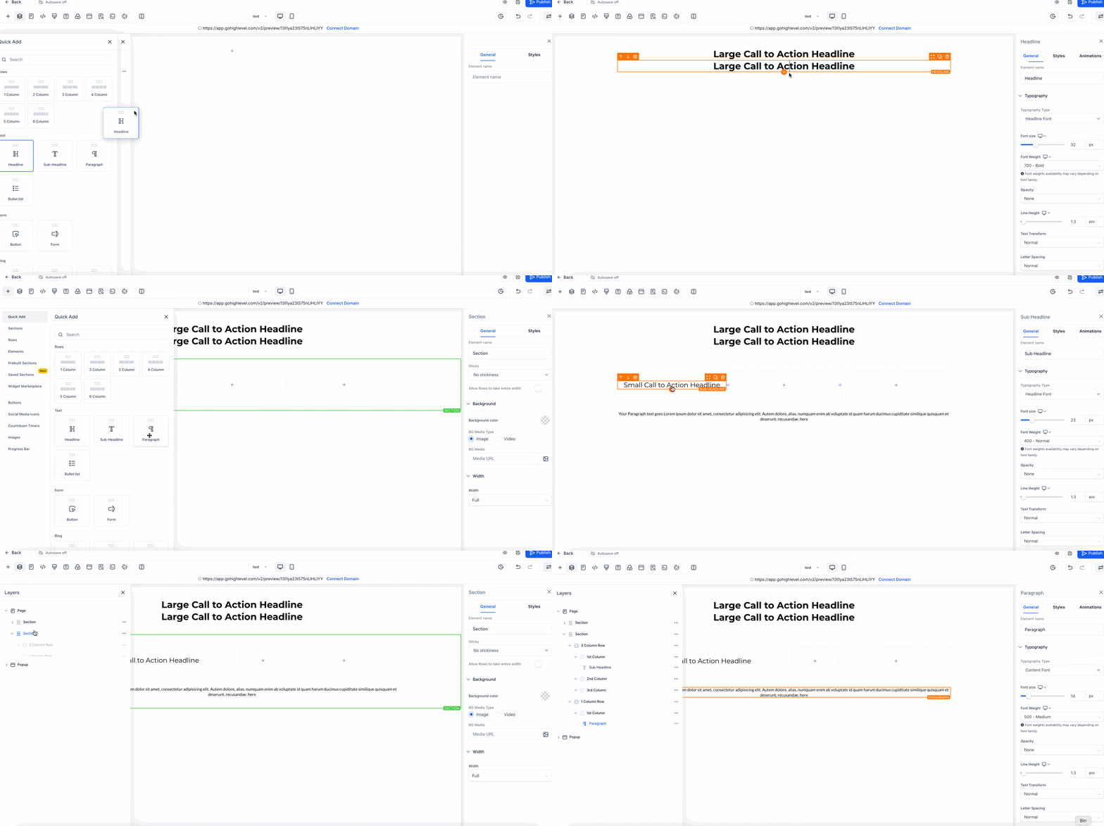
3.1 Check if the canvas has no elements, sections, rows, or columns.
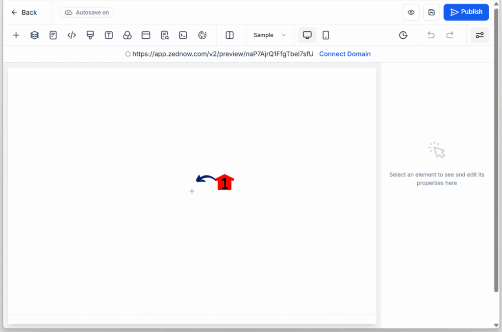
Step 04 – Add an Element
4.1 Drag and drop any element to test the update.
- In this example, we’re using a Paragraph element.
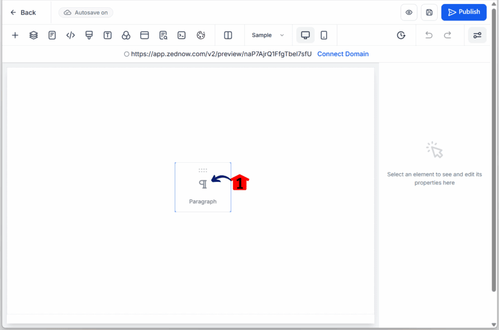
Step 05 – Confirm Auto-Structure
5.1 Check that a section, a column, and a single row automatically appear around the paragraph element.
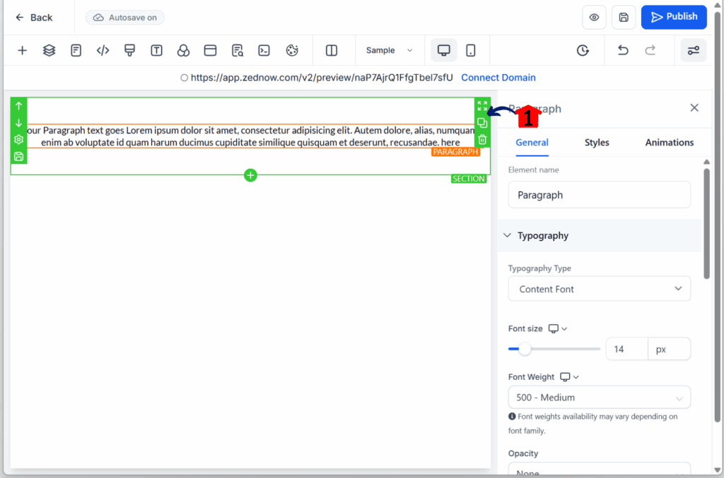
Step 06 – Add a Multi-Column Layout
6.1 Drag and drop a four-column element onto the canvas.
- You should see a new section appear automatically.
6.2 Add another element and drop it under the added column.
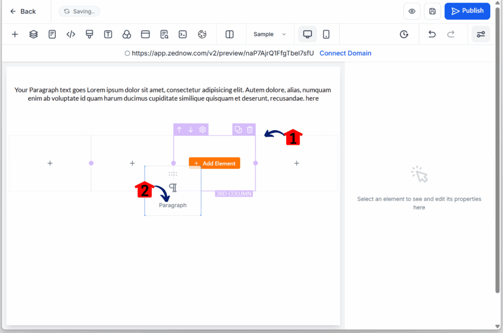
Step 07 – Confirm Nesting Structure
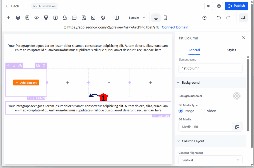
7.1 Check if the newly added element appears directly beneath the four-column layout.
- You’ll notice it’s nested within a single row.
Quick Tips:
- Use collage mode for image-heavy grids
- Keep margin/padding consistent to avoid lopsided layouts
- Test on mobile early—nested containers adapt well, but spacing tweaks may still be needed
Cleaner Pages, Less Frustration
You know that feeling when your layout finally clicks—everything lines up, looks good, and works on mobile? That’s the goal here. With nested containers, getting a solid, responsive page design just got a lot easier.
This update doesn’t overcomplicate things. It just gives you better tools to build with. Here’s what you’ll notice:
- Your pages look cleaner – No more odd spacing or blocks that feel out of place. Everything sits where it should.
- Mobile views don’t break – Layouts adjust on their own. You won’t have to rebuild sections just to get them to stack right.
- Faster builds – Set up your structure once, and reuse it. No need to start from scratch every time.
- Real design options – Want two-column opt-ins? Pricing tables? Testimonials in a clean grid? Now you can build them without weird workarounds.
- Fewer layout headaches – You’re not fighting the builder anymore. Nested containers give you the structure that supports your content—and your workflow.
If you’ve been struggling to get clean, responsive page design without jumping through hoops, this is a real fix.
Start Building with Fewer Limits
This update doesn’t try to wow you—it just works. If you’ve been trying to get a responsive page design without workarounds or broken layouts, nested containers are the fix.
They give you structure that makes sense. You can finally build the sections you’ve wanted—grids, columns, stacks—and know they’ll hold up on mobile without extra effort.
Now’s a good time to try it out. Set up a page, drop in some nested layouts, and see how much smoother it feels. You’ll spend less time fixing and more time creating.
Tried it already? Show us what you built. We’re always up for smart ideas and clean designs.
Scale Your Business Today.
Streamline your workflow with GoHighLevel’s powerful tools.
