- Adjust height and width for any element with precision no custom CSS required.
- Quick Summary – Element Size Controls Overview
- New size controls for any element
- Where to find the new controls
- Why element size control changes everything
- How to Use – Adjust Element Size in GHL Page Builder
- Tips for better results with element size controls
- Frequently Asked Question about element size controls
- Why this small feature makes a big difference
- What happens when you start using size controls
- Final thoughts on element size controls
Adjust height and width for any element with precision no custom CSS required.
Why layout control matters for every funnel
Element size controls are now part of the GHL Page Builder, giving you direct control over the height and width of any element. Before this update, adjusting layouts often meant stacking padding, tweaking margins, or writing custom CSS. None of that felt clean, and it rarely saved time.
With this update, you can size buttons, images, containers, or text blocks exactly how you want them. Everything is handled in the Styles tab under Container Size, so you can set values quickly without workarounds.
This feature makes page building smoother, more precise, and much easier to manage. Once you start using element size controls, you’ll wonder how you built pages without them.
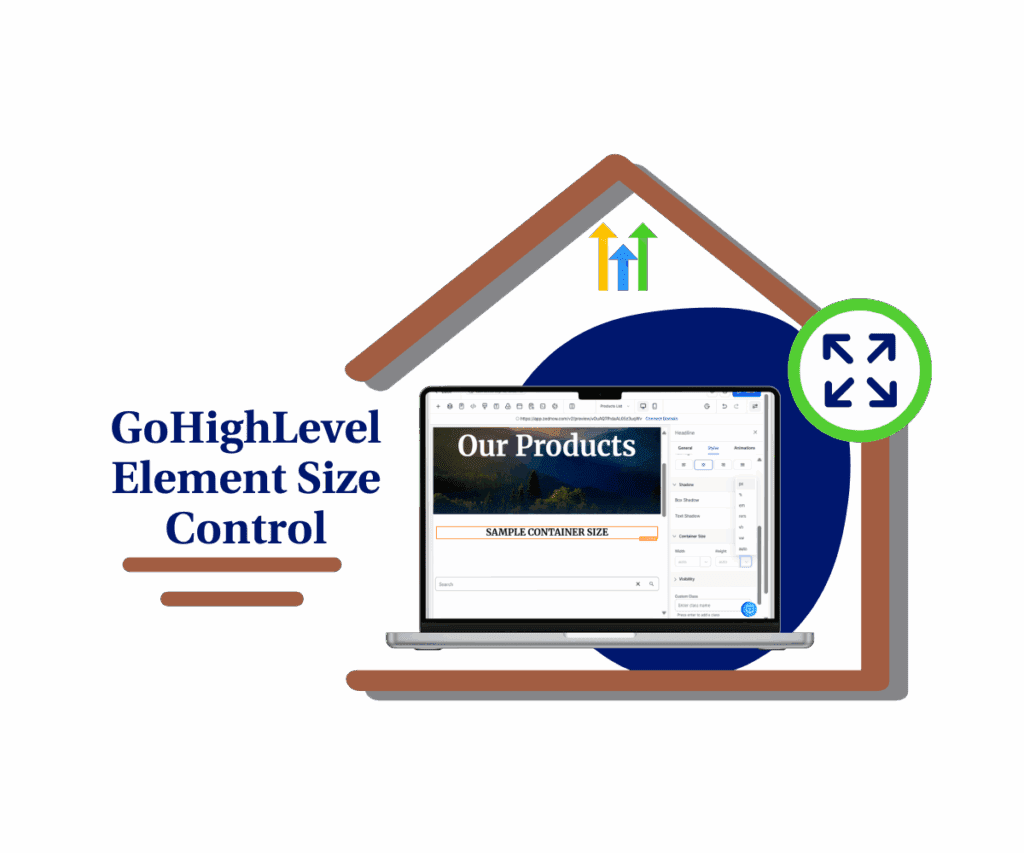
With GHL’s new element size controls, you can adjust the height and width of anything on the page. No need to write CSS or guess spacing. Just point, set, and build faster pages that work better on every screen.
Quick Summary – Element Size Controls Overview
Purpose: This update lets you set height and width for any element in the GHL Page Builder without custom code.
Why It Matters: It gives you precise control over layouts, helps avoid spacing hacks, and speeds up the page design process.
What You Get: A simple way to adjust element size using built-in controls for all views, right inside the Styles tab.
Time To Complete: Less than 5 minutes to start using it. No setup or learning curve.
Difficulty Level: Easy. If you’ve used the Page Builder before, you’ll pick this up right away.
Key Outcome: Cleaner, more responsive designs that save time and reduce layout headaches.
New size controls for any element
You can now set the height and width of any element in the GHL Page Builder. This includes buttons, text blocks, images, containers, and more.
The new element size controls live in the right sidebar, inside the Styles tab under Container Size. It’s easy to find and even easier to use.
Automate marketing, manage leads, and grow faster with GoHighLevel.

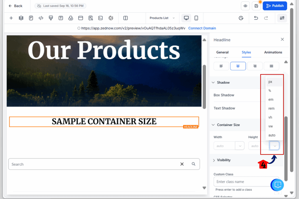
You can choose from different units like:
- px for fixed size
- % for flexible layouts
- em and rem for text-based sizing
- vh and vw for full screen sections
- auto when you want GHL to handle it
These controls work for desktop and mobile views. That means you can fine-tune your layout for every screen without writing code.This update is all about giving you more control, right where you need it.
Where to find the new controls
Before this update, if you wanted to adjust the height or width of an element, your options were limited. You had to stack padding, mess with columns, or write custom CSS. It worked, but it wasn’t ideal.
Now, GHL has made it simple.
Inside the Page Builder, click on any element and go to the Styles tab. Scroll down to the section called Container Size. That’s where you’ll see the new controls for both height and width.
You can type in values manually or use the slider to adjust. And you’re not stuck with pixels either. You can pick from a full range of units that work across desktop and mobile.
These controls also play well with layout settings like space-between and space-around, so your horizontal layouts stay consistent.It’s a small shift in the interface that adds a lot of flexibility.
Why element size control changes everything
When you’re building pages for clients or running your own funnel, layout problems slow you down. You want that button centered. You want that image a bit taller. But without clean size controls, you end up fighting with spacing.
This update fixes that.
With element size controls built right into the builder, you don’t need custom code or design tricks. You can set the height and width of any element and see the results instantly.
It’s not just about saving time. It’s about keeping things clean, consistent, and easy to update later. If someone on your team edits the page, they won’t have to guess how spacing was handled.Now, every layout choice is clear and easy to manage. That’s a big win, especially for teams working across multiple sub-accounts.
How to Use – Adjust Element Size in GHL Page Builder
GHL’s new element size controls are built right into the Page Builder. You can now set the height and width for any element without using code. Here’s how to use it:
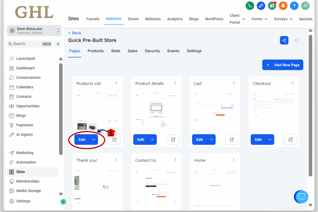
Step 01: Access the Main Left Hand Menu in GoHighLevel
- The Main Menu on the Left side of your screen has all the main areas that you work in when using GHL
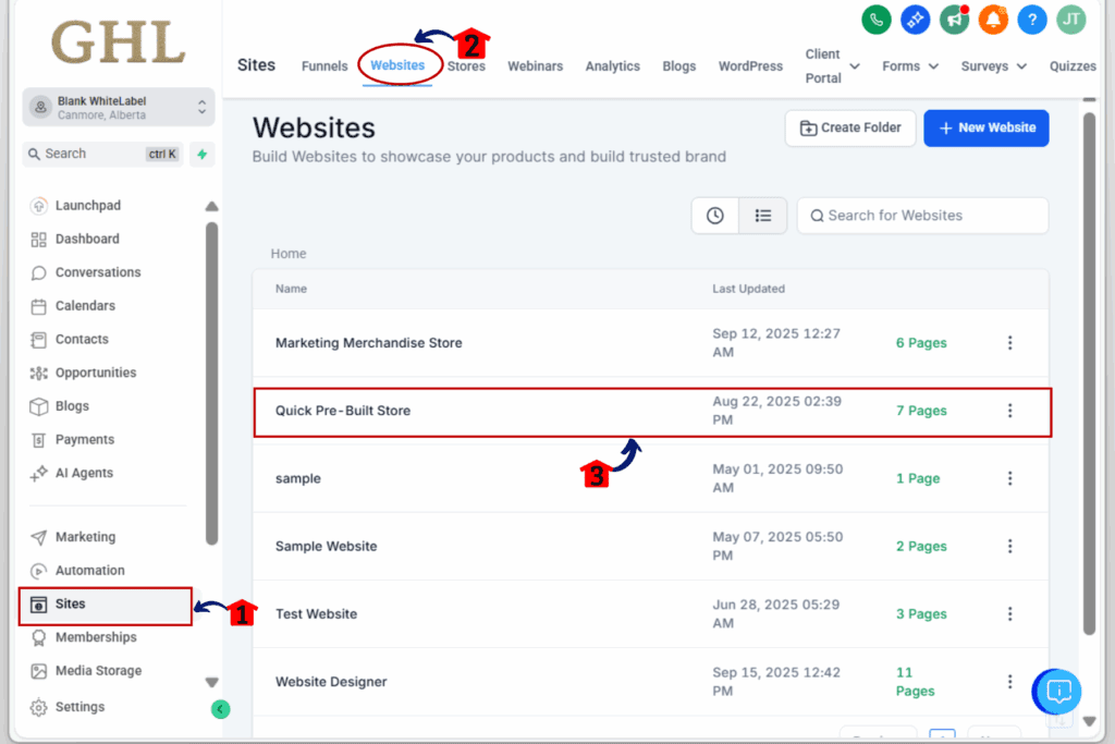
1.1 Click on the Sites Menu Item.
- Access the ‘Sites’ section of GoHighLevel
- You’ll now be in the ‘Sites’ section of GHL, where you can access Funnels and Websites section from the top menu
1.2 Click ‘Websites’ or ‘Funnels’ depending on your layout
- You can choose either ‘Websites’ or ‘Funnels’ “Element size controls work in both
1.3 Select the page you want to edit
- this will open a new window where you can see all the pages inside the website
Step 02: Launch the Page Builder
- Open the editor where you can apply your new size settings.
2.1 Click ‘Edit Page’ on the layout you want to update
- This loads the drag-and-drop builder.
Step 03: Select the Element You Want to Resize
- You can apply height and width to most elements.
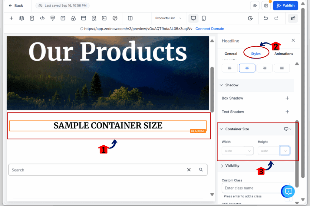
3.1 Click directly on the element (image, text, button, etc.)
- Make sure it’s highlighted in the builder.
3.2 Click the Styles Tab in the Right Sidebar
- This is where all the design controls are located.
3.3 Find the section labeled ‘Container Size’
- It will show width and height fields for the selected element.
3.4 Enter a value into the Width and/or Height field
- Type the number, then choose your unit (px, %, rem, vh, etc.)
Step 04: Set Different Sizes for Desktop and Mobile
- Make your layout work on every screen size.
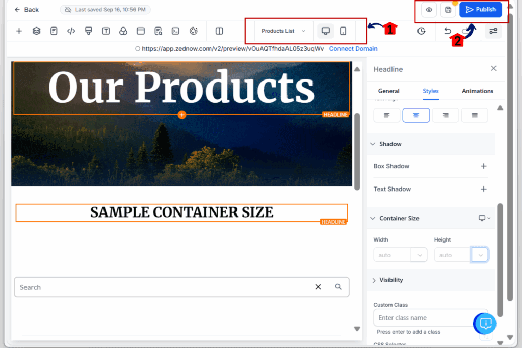
4.1 Use the top device toggle in the builder to switch views
- Choose Desktop, Tablet, or Mobile to set different values.
4.2 Repeat the size input for each view as needed
- This helps you stay responsive without needing media queries.
4.3 Click ‘Save’ in the top-right corner
- Always save before leaving the builder.
4.4 Use the Preview option to check your layout across screen sizes
- Make sure nothing is overlapping or cut off.
That’s it. You’ve now used GHL’s new element size controls to fine-tune layout spacing without needing CSS or guesswork.
Tips for better results with element size controls
Now that you’ve got access to height and width settings, here are a few simple tips to help you get cleaner, more flexible designs:
- Use % for flexible layouts
- Setting a width like 50% or 33% helps you create even columns or responsive rows without breaking things on smaller screens.
- Use vh and vw for full-screen sections
- Want a hero section that fills the screen? Set height to 100vh. Want something to stretch edge to edge? Try 100vw on a full-width container.
- Don’t mix height with heavy padding
- If you set a fixed height and also add a lot of padding, things can get tight fast. Choose one or the other for spacing.
- Use auto when you’re unsure
- Sometimes it’s best to let the content decide. Setting width or height to “auto” can help keep things balanced.
- Adjust per device
- Make sure to check each layout view. A height that looks great on desktop might be way too tall on mobile.
These tips can save you hours of back-and-forth and help you build with more confidence.
Frequently Asked Question about element size controls
Why this small feature makes a big difference
This update might seem minor on the surface, but it solves a long-standing headache for many GHL users.
Before now, adjusting layouts often meant patching things together with extra spacing or custom CSS. It worked, but it wasn’t smooth or scalable. And when someone else on the team jumped in, it usually broke something.
With element size controls, the process is clear. Every setting is right there in the builder. You don’t need extra tools, extra time, or a developer to get clean, responsive layouts.
It also means fewer layout surprises when switching between desktop and mobile. And when a client asks for a change, you can fix it fast without digging through code or second-guessing someone else’s setup.This is what better tools look like. Simple, direct, and built to make your work easier.
What happens when you start using size controls
When you start using the new element size controls, things get easier fast.
Your layouts will look cleaner. You won’t need to stack spacers or guess padding. Just set the size you need and move on.
Your pages will also work better on every screen. You can set different sizes for mobile and desktop, so things line up without breaking. It keeps everything more consistent.
It also helps your team. Anyone editing a page will see what’s going on and won’t have to guess what size hack was used.
The more you use it, the less time you’ll spend fixing layout issues. And that means fewer delays, fewer headaches, and fewer client emails about spacing problems.
This is one of those simple updates that clears up a lot of friction.
Final thoughts on element size controls
Element size controls may not seem like the biggest feature in GHL, but they solve a problem that almost every user has faced. Spacing and sizing have always been tricky, and until now the only fixes were padding tricks or custom CSS. This update clears that frustration with a tool that is simple, direct, and easy to use.
With element size controls, you can set the height and width of any element in the Page Builder in just a few clicks. It works across text, images, containers, and buttons, giving you flexibility without extra steps. The controls are responsive too, which means you can fine-tune layouts for desktop and mobile without breaking your flow.
If you’ve ever wasted time trying to line up sections or make elements consistent, this feature will feel like a relief. Take a few minutes to test element size controls on your next funnel or landing page. You’ll see how much cleaner and faster your builds become.
This update is about working smarter, not harder. And with element size controls now built into GHL, you finally have the clarity and control you need to design pages the right way, every time.
Scale Your Business Today.
Streamline your workflow with GoHighLevel’s powerful tools.
