- Why Default Page Styling Matters
- Quick Summary – Default Page Styling Essentials
- Fresh Fonts, Images, and Color Presets
- From Bland to Branded—By Default
- Save Time, Look Better, Scale Faster
- How to Use the Updated Default Page Styling
- Work Smarter with These Styling Shortcuts
- What You Need to Know About the Defaults
- Build Smarter with Better Defaults
Why Default Page Styling Matters
Let’s face it, ugly pages kill conversions. Whether you’re spinning up a funnel or a full site, the look and feel matter big time. That’s why GHL’s fresh default styling update isn’t just a facelift, it’s a fast lane to better design without all the fiddling.
Previously, starting from scratch meant manually adjusting fonts, replacing bland content, or tweaking colors just to make things look halfway decent. Not anymore.
Now, with GHL’s upgraded default page styling, new elements come pre-loaded with a clean, professional look that actually helps you move faster and look better doing it.

With GHL’s new default page styling, you get modern fonts, updated visuals, and brand-new color presets that make every page look polished from the start, no design degree needed.
Quick Summary – Default Page Styling Essentials
Purpose: This update improves the default design experience in GHL’s Page Builder.
Why It Matters: It saves time, ensures visual consistency, and delivers cleaner pages from the start.
What You Get: Inter font as default, better placeholder images, and two new color presets (Cobalt & Smoke).
Time to Complete: You’ll notice the new styling instantly when adding elements, no setup needed.
Difficulty Level: Beginner
Key Outcome: Faster default page styling builds, fewer design tweaks, and a more professional look right out of the box.
Fresh Fonts, Images, and Color Presets
Here’s what’s now baked into every new element you add in the GHL default page styling Builder:
1. Typography Upgrade:
Both headline and content fonts now default to Inter, a clean, modern typeface designed for digital readability. No more clunky font mismatches or playing “guess the font.” Every text block now starts with cohesion in mind.
Automate marketing, manage leads, and grow faster with GoHighLevel.

2. Smarter Placeholders:
They finally ditched those bland, gray boxes. Now when you drop in a new section, the images and text actually look usable, not like some intern tossed in lorem ipsum and called it a day.
3. Modern Color Palette:
Two fresh colors have been added to your palette:
- Cobalt: A strong, tech-friendly blue
- Smoke: A soft, neutral gray
These pair well with most brand palettes and give your sections a cleaner, more polished feel straight out of the gate.
Every new element now reflects these changes automatically, giving your default page styling a head start before you even start customizing.
From Bland to Branded—By Default
If you’ve been building in GHL for a while, you know the old default styling was… functional. But it didn’t exactly wow anyone. You’d drop in a headline and get some generic serif font. Add an image block, and you’d see a gray box with “Your Image Here.” Not very inspiring.
Now? It’s a different story.
The new defaults were built to look good before you touch anything. That means:
- Typography now has consistent sizing, spacing, and alignment.
- Images come with cleaner framing and better aspect ratios.
- Color palettes make sections pop with professional contrast.
Now you’re not wasting time patching up fonts and spacing right out the gate. Everything drops in looking sharp, ready for real content, not just placeholders.
It’s not just cosmetic, it’s a workflow improvement. Every design choice GHL made with these updates helps speed up the page-building process without sacrificing quality.
Save Time, Look Better, Scale Faster
When you’re building client sites or launching funnels on the fly, speed and style aren’t negotiable, they’re survival tools. That’s what makes this GHL update so valuable.
With the new default styling:
- You spend less time fiddling with fonts and colors
- Pages look client-ready faster, which means fewer revision requests
- Your entire agency can standardize on a clean, modern look
It’s like having a smart design assistant baked into the default page styling Builder.
If you’re handling multiple clients, this is a game-changer. Start with the cleaner defaults, then drop in your client’s colors and content. You’ll get better pages out the gate, and get them done faster.
And if you’re a solo creator? You’ll still feel the difference. Less time fixing design = more time selling, scaling, or sipping that well-earned coffee.
How to Use the Updated Default Page Styling
GHL just made your design workflow faster by pre-styling every new default page styling element with clean fonts, modern visuals, and brand-ready colors. Here’s how to take full advantage of it. You don’t need to enable anything, this is now the default experience when building in Page Builder.
Step 01 – Open the Page Builder
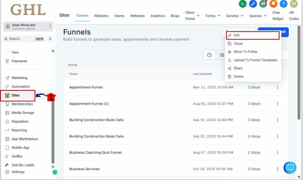
1.1 Go to the left-hand menu in your GHL dashboard
1.2 Click on Sites > Funnels or Websites, then open or create a page
1.3 Click Edit Page to launch the Page Builder
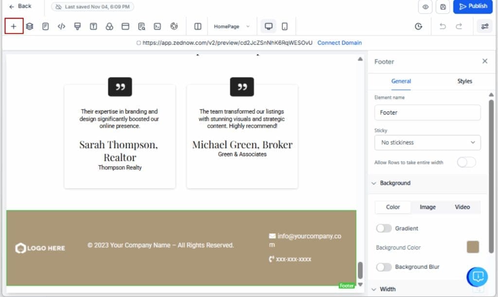
Step 02 – Add Any Page Element
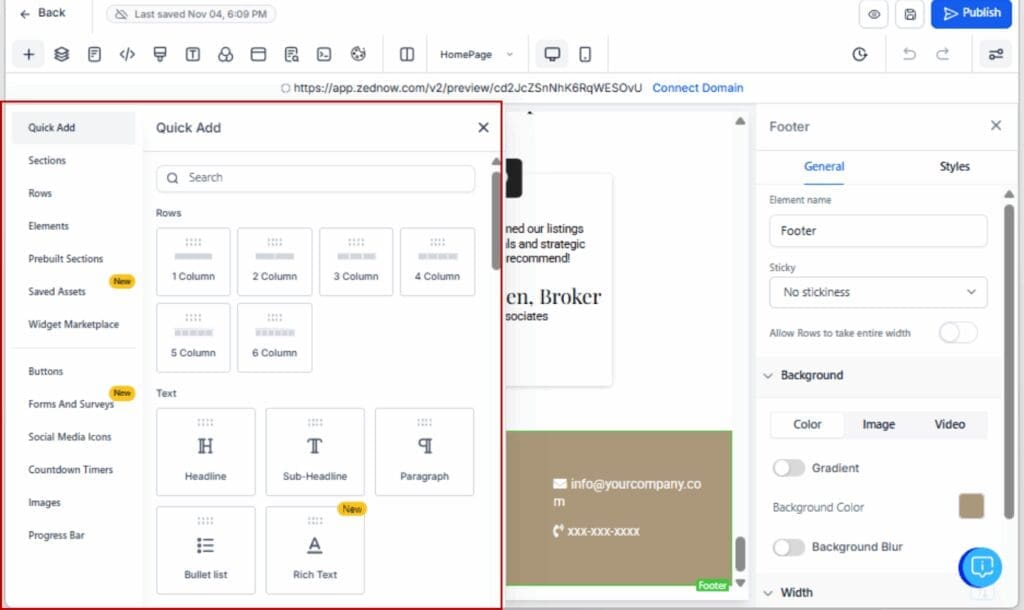
2.1 Look to the left panel and click + Add Elements
2.2 Choose whatever you want to drop in: text, images, buttons, sections, etc.
2.3 Drag and drop it onto your page canvas
Step 03 – See the New Defaults in Action
3.1 Headline and paragraph text will now use the Inter font
3.2 Default image placeholders have been updated
3.3 Backgrounds, buttons, and lines may use the new Cobalt and Smoke colors
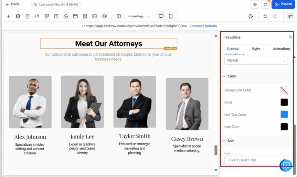
Step 04 – Customize for Your Brand
4.1 Click on any element to adjust colors, fonts, or spacing
4.2 Use the Design tab to override styles if needed
Step 05 – Save as Templates or Snapshots
5.1 Combine styled elements into a layout and save as a Section Template
5.2 Or save full funnels and pages into a Snapshot for reuse
5.3 Share branded pages with your team or clients at scale

That’s it. You’re now building with a smarter, cleaner starting point, no custom code, no extra styling required.
Work Smarter with These Styling Shortcuts
The new default styling gives you a leg up—but you can stretch its power even further with a few insider moves. These aren’t hacks; they’re workflow accelerators designed to make your agency look sharp and move fast.
1. Lock in a Clean, Reusable Layout
Why rebuild the same layout over and over? If you’ve dialed in a solid section, just save it. Then you can drag it into any new default page styling without redoing the work.
2. Build Brand-Ready Snapshots
If you serve multiple clients or niche industries, combine styled default page styling into a snapshot. That way, you can duplicate clean layouts across sub-accounts and skip the “start from scratch” headache every time.
3. Keep Typography Tight
Stick with Inter unless you have a good reason not to. It’s mobile-friendly, ultra-legible, and blends well across device types. If you do change fonts, do it globally through Custom Values.
4. Treat Cobalt and Smoke as Base Colors
Use Cobalt for call-to-action buttons and Smoke for backgrounds or dividers. They’re neutral enough to adapt to most brands, and they help keep default page styling looking crisp even before you customize.
5. Train Your Team Once, Scale Fast
Now that the default elements are cleaner, train your VAs or team members to use them as-is. Less tweaking means faster builds and fewer client revisions.
Remember: default doesn’t mean generic. With the right process, it means optimized.
What You Need to Know About the Defaults
Build Smarter with Better Defaults
This isn’t just a fresh coat of paint. GHL’s new default styles actually make your workflow smoother, so whether you’re solo or running a full team, you’re starting with a setup that looks good right away.
No more wasting time redoing font styles, replacing low-quality placeholder images, or trying to force cohesion where there wasn’t any. GHL’s new default setup gives you clarity, consistency, and momentum from the second you hit “Add Element.”
If you haven’t played with it yet, jump into your Page Builder and drop in a headline or image. You’ll see the difference instantly.
And if you’re building for clients? They’ll notice too.
So go ahead, ditch the clunky templates and elevate your baseline. Your default page styling (and your clients) will thank you.
Scale Your Business Today.
Streamline your workflow with GoHighLevel’s powerful tools.