- Image Layout Controls Were Functional (But Limited)
- Quick Summary – Image Layout Controls Essentials
- Here are this weeks HighLevel Updates
- What’s New with Image Layout Controls
- Forms vs Surveys Image Layout Controls
- Why Image Layout Controls Matter
- How to Use Image Layout Controls in GHL
- Pro Tips for Using Image Layout Controls
- What Image Layout Controls Mean for Your Business
- Real-World Use of Image Layout Controls
- Image Layout Controls FAQs
- Final Thoughts on Image Layout Controls
Image Layout Controls Were Functional (But Limited)
Image Layout Controls inside GHL Forms and Surveys were functional. But they were limited. You could add an image. You could place it at the top. And that was about it.
There wasn’t much control over spacing. You couldn’t fine-tune alignment. Fixed layouts didn’t let you control what part of the image stayed visible. And surveys forced every slide to follow the same layout rules.
It worked. But it wasn’t flexible.
Agencies building branded funnels felt it most. Designers wanted tighter spacing. Marketers wanted better visual balance. And anyone using images with faces or product shots struggled when the wrong part of the image got cropped.
Spacing felt rigid. Image positioning felt basic. Survey slides couldn’t adapt visually. The design tools just weren’t built for precision. GHL has now fixed that limitation.
Instead of being stuck with basic image placement, you can now choose from four layout styles that place your image beside your form fields. Center layouts let you tweak spacing and soften the corners to match your brand. Fixed layouts give you control over what part of the image stays visible. And if you’re building surveys, you can customize each slide individually instead of using the same layout across the entire flow.
No more locked-in spacing. No more awkward cropping. No more one-layout-fits-all survey slides.
What changed: Inside Forms and Surveys, you can now choose from four new image layouts. Center layouts include adjustable corner radius and image-field spacing. Fixed layouts let you choose a focal point directly on the image. Surveys now allow independent slide-level image layout customization.
Who this is for: Agency owners building branded lead funnels. Marketers optimizing form conversions. Designers who care about spacing and polish. VAs managing survey builds. And any GHL user who wants cleaner, more professional-looking forms.
What we’ll demonstrate: In this breakdown, we’ll walk through what’s new in Image Layout Controls, explain why it matters for user experience and conversions, show you exactly how to use the new layout options inside Forms and Surveys, and share practical tips to make your builds look sharper and convert better.
The latest GoHighLevel Changelog includes several other GHL feature updates that round out your daily workflow:
- New QR Code Styling Options: Shapes, Borders, and Rim Text
- Collapse & Resize Pipeline Stages in Kanban View
- Notes just got smarter for the contacts page!
- New Asana actions in workflows – Find Project and Find section
- Email AI + Knowledge Base Integration 🚀
- Dialer: Auto-minimize, Pin & Drag
- Schema Markup Using AI
Keep reading for much more on all these updates and a deep dive into the Image Layout feature!

Quick Summary – Image Layout Controls Essentials
Purpose: This update introduces Image Layout Controls inside GHL Forms and Surveys, giving you more control over image placement, spacing, focal points, and slide-level customization.
Why It Matters: Better layout control improves user experience, strengthens brand consistency, and increases perceived professionalism, which directly impacts form conversions.
What You Get: Four new layout options, adjustable corner radius and spacing for center layouts, focal point control for fixed layouts, and independent slide-level image customization in surveys.
Time to Complete: Most users can implement and test the new Image Layout Controls inside a form or survey in under 10 minutes.
Difficulty Level: Beginner to Intermediate. The controls are easy to access, but thoughtful design decisions will maximize results.
Key Outcome: Cleaner, more polished forms and surveys that look intentional, align with your brand, and convert more consistently.
Here are this weeks HighLevel Updates
New QR Code Styling Options: Shapes, Borders, and Rim Text
What it does:
Lets you stop using boring QR codes. You can now tweak the shape, style the border, and add text around the edge.
Where in GHL:
Accessible via Sites → QR Codes and within QR tools embedded in Funnel and Website builders.
Automate marketing, manage leads, and grow faster with GoHighLevel.

Impact:
Improves visual presentation and brand alignment while increasing scan appeal.
Best suited for:
Agencies that care about branding, small businesses running local promotions, online stores, and teams pushing QR campaigns.
Collapse & Resize Pipeline Stages in Kanban View
What it does:
Lets you hide pipeline stages you’re not actively using and adjust column widths so your board fits the way you work.
Where in GHL:
Inside Opportunities when you’re viewing your pipeline in Kanban mode.
Impact:
No more dragging your screen forever just to find the deals that matter.
Best suited for:
Owners running multi-stage pipelines, reps working deals every day, and anyone fed up with a messy board.
Notes Just Got Smarter for the Contacts Page
What it does:
Upgrades the notes area so it’s easier to write, review, and keep things organized inside a contact record.
Where in GHL:
Found directly within each contact’s profile under Notes.
Impact:
Makes it simpler to see what’s been discussed and who added what — without digging through clutter.
Best suited for:
Teams collaborating on accounts and businesses that document every client touchpoint.
New Asana Actions in Workflows – Find Project & Find Section
What it does:
Lets your workflow check what already exists in Asana before adding anything new.
Where in GHL:
Go to Workflows, add an action, and choose the Asana integration.
Impact:
No more duplicate projects. No more messy task boards. Just cleaner automation.
Best suited for:
Operations teams and agencies that rely on Asana to manage client delivery.
Email AI + Knowledge Base Integration
- What it does:
Allows Email AI to reference your Knowledge Base for smarter, more accurate responses. - Where in GHL:
Found in Conversations → Email composer with AI enabled and Knowledge Base settings under AI configuration. - Impact:
Smarter email suggestions that understand your business and help you reply quicker. - Best suited for:
Support teams, agencies managing inboxes, and businesses scaling communication with AI.
Dialer: Auto-Minimize, Pin & Drag
- What it does:
Lets you auto-minimize the dialer during calls, pin it in place, and drag it anywhere on screen. - Where in GHL:
Found in Conversations → Dialer. - Impact:
Cleaner workspace and easier multitasking during sales or support calls. - Best suited for:
Sales teams, outbound callers, appointment setters, and agencies making daily calls.
Schema Markup Using AI
- What it does:
Generates structured schema markup automatically using AI for SEO enhancement. - Where in GHL:
Found in Sites → Website or Funnel settings within AI or SEO sections. - Impact:
Improves search visibility without manual coding. - This works well for:
Teams building websites that need stronger search visibility, from agencies to small local businesses.
What’s New with Image Layout Controls
Image Layout Controls now give you real design flexibility inside Forms and Surveys. This isn’t just a visual tweak. It’s structured layout control.
Here’s exactly what’s new.
Four New Image Layout Options
You now have four additional layout choices:
- Left Center
- Right Center
- Left Fixed
- Right Fixed
These layouts allow your image to sit beside your form fields instead of being locked at the top. This immediately improves visual balance.
Instead of stacking everything vertically, you can now create split layouts that feel modern and intentional.
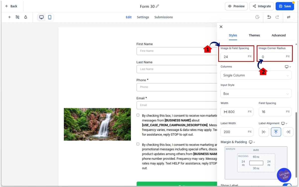
Center Layout Styling Controls
If you choose Left Center or Right Center, you unlock two new controls:
- Image Corner Radius
- Image-Field Spacing
Image Corner Radius allows you to soften or square off your image edges. This is perfect for matching brand style.
Image-Field Spacing allows you to control the gap between your image and the form fields. No more cramped layouts. No more awkward spacing. You decide how tight or open the layout feels.
Focal Point Selector for Fixed Layouts
If you select Left Fixed or Right Fixed, you now get access to a Focal Point setting.
This is a big one. You can click directly on the image and choose which area should remain in focus.
This prevents faces from getting cut off. It prevents product images from being cropped poorly. It keeps the most important part of your image visible across different screen sizes. Instead of the system guessing what matters, you tell it.
Survey Slide-Level Customization
Previously, surveys forced every slide to follow the same main layout settings. That’s changed. You can now override image layout settings at the slide level.
Inside a survey slide’s settings, you can switch Image Layout Settings to “Independent.” From there, you can apply a different layout or even a different image for that specific slide.
This gives you:
- Better storytelling across multi-step surveys
- Visual variation between questions
- More control over user flow
Important Limitations to Know
Not every layout supports every setting.
- Image Corner Radius and Image-Field Spacing only apply to Left Center and Right Center layouts.
- These controls do not apply to the Top layout.
- Left Fixed and Right Fixed do not use Image Corner Radius. They continue using the existing form radius setting.
Understanding which layout unlocks which controls is key. Choose the layout first. Then adjust the available styling settings.
Forms vs Surveys Image Layout Controls
Image Layout Controls behave slightly differently in Forms and Surveys. Understanding this difference matters. Because layout control works at different levels depending on what you’re building.
How It Works in Forms
In Forms, Image Layout Controls apply at the form level. When you enable “Show Image” inside the Styles tab and choose a layout, that layout controls the entire form.
There’s no per-section override. You select your layout. You configure spacing or focal point (depending on layout). And that styling applies across the form.
If you choose:
- Left Center or Right Center → You get Image Corner Radius and Image-Field Spacing controls.
- Left Fixed or Right Fixed → You get the Focal Point selector.
Forms are straightforward. One layout. One image. One consistent visual structure.
How It Works in Surveys
Surveys now have two levels of control.
Level One: Global Layout
By default, every survey slide follows the main survey image layout.
This keeps your design consistent across the entire survey.
Level Two: Slide-Level Override
This is the upgrade. Inside any individual survey slide, you can open that slide’s settings and change Image Layout Settings to “Independent.”
When you do that, you can:
- Choose a different image for that slide
- Apply a different layout type
- Customize the visual experience per question
This is powerful for multi-step surveys.
For example:
- Slide 1: Brand introduction image
- Slide 2: Product image
- Slide 3: Show a customer success visual
- Slide 4: Finish with a bold “take action” image
Earlier, your survey looked identical from start to finish. Now you can shape how it unfolds visually.
Here’s How They Compare
Forms:
- Layout applies globally to the entire form
- No slide-level overrides
- Ideal for single-step lead capture
Surveys:
- Default global layout
- New Independent slide-level option
- Ideal for storytelling or multi-step qualification
If you’re building basic opt-in forms, Forms are simple and clean. If you’re building multi-step experiences, Surveys now give you much more creative control.
Why Image Layout Controls Matter
Design isn’t just about looking good. It’s about guiding attention.
Image Layout Controls directly affect how users experience your forms and surveys. And that impacts conversions more than most people realize.
Better Visual Hierarchy
When your image sits beside your form fields instead of stacked on top, the layout feels balanced. Cleaner. More intentional.
Left and Right layouts create a natural reading flow. The eye moves from image to form fields smoothly. That reduces friction. Small detail. Big difference.
Improved User Experience
Cramped spacing kills trust. When images feel too close to text, or when important parts of an image get cropped, it creates subtle discomfort. Users may not consciously notice it. But they feel it.
With adjustable image-field spacing and focal point control, you remove those friction points. The experience feels polished. And polished experiences convert better.
Stronger Brand Alignment
Agencies and marketers care about consistency. Rounded corners. Spacing symmetry. Balanced layouts. Now you can match your form design to your funnel style. If your brand uses soft rounded visuals, adjust the corner radius.
If your brand uses sharp edges and bold structure, square it off. Before, you had to work around limitations. Now, you design with intention.
More Professional Survey Flow
Slide-level customization changes how surveys feel. Instead of one static design repeating across every question, you can tailor visuals per slide.
That means:
- Contextual imagery per question
- Product visuals where relevant
- Emotional visuals when needed
You control the storytelling rhythm. And storytelling increases engagement.
Higher Perceived Value
Let’s be honest. When forms look basic, they feel cheap. When forms look structured and designed, they feel premium. Even if nothing else changes.
Image Layout Controls give your forms that premium feel. And premium perception influences whether someone submits… or leaves.
How to Use Image Layout Controls in GHL
Using Image Layout Controls happens inside the Forms and Surveys builder in GoHighLevel. You will first enable the image setting, then select a layout type, and finally adjust the available styling controls based on your selection. The layout you choose determines which customization options appear.
In the steps below, you’ll learn how to access Forms and Surveys, turn on images, select the correct layout, adjust spacing or focal point settings, and apply slide-level overrides in surveys. Follow each step carefully and you’ll have full control over your form and survey image design.
- Access Forms in Main Menu in GHL.
- Enable Image Layout Controls in Styles.
- Choose Your Image Layout in styles.
- Adjust Layout-Specific Settings of the images.
- Preview and Test the forms.
To start, make sure you are logged in to your GoHighLevel sub-account.
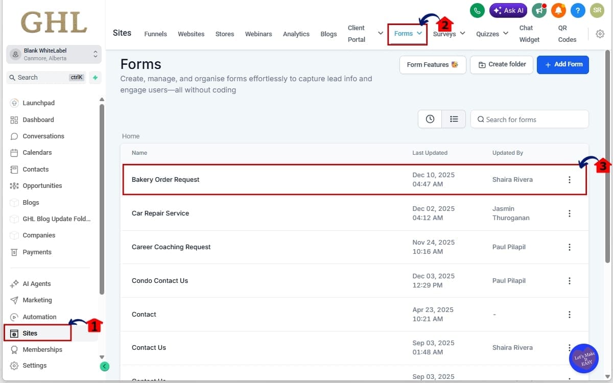
Step 01 – Access Forms in Main Menu in GHL
- The Main Menu on the left side of your screen has all the main areas you work in when using GHL.
1.1 Click on the “Sites” menu item.
- You’ll now see the top navigation inside the Sites section.
1.2 Click “Forms” to edit a form
- Open the form you want to modify.
1.3 Edit existing forms from the lists.
- Open the form you want to modify.
Step 02 – Enable Image Layout Controls in Styles
- Before adjusting layout settings, you must activate the image feature inside your form or survey.
2.1 Inside the builder, click on the “Styles” tab in the right-hand panel.
- This is where all visual and layout settings are managed.
2.2 Under Layout, toggle ON “Show Image.”
- This enables the image container and unlocks layout options.
2.3 Upload a new image or select one from your media library.
- Choose an image that aligns with your offer or branding.
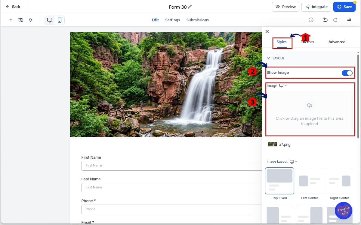
Once the image is enabled, the Image Layout dropdown will appear with the new layout options available.
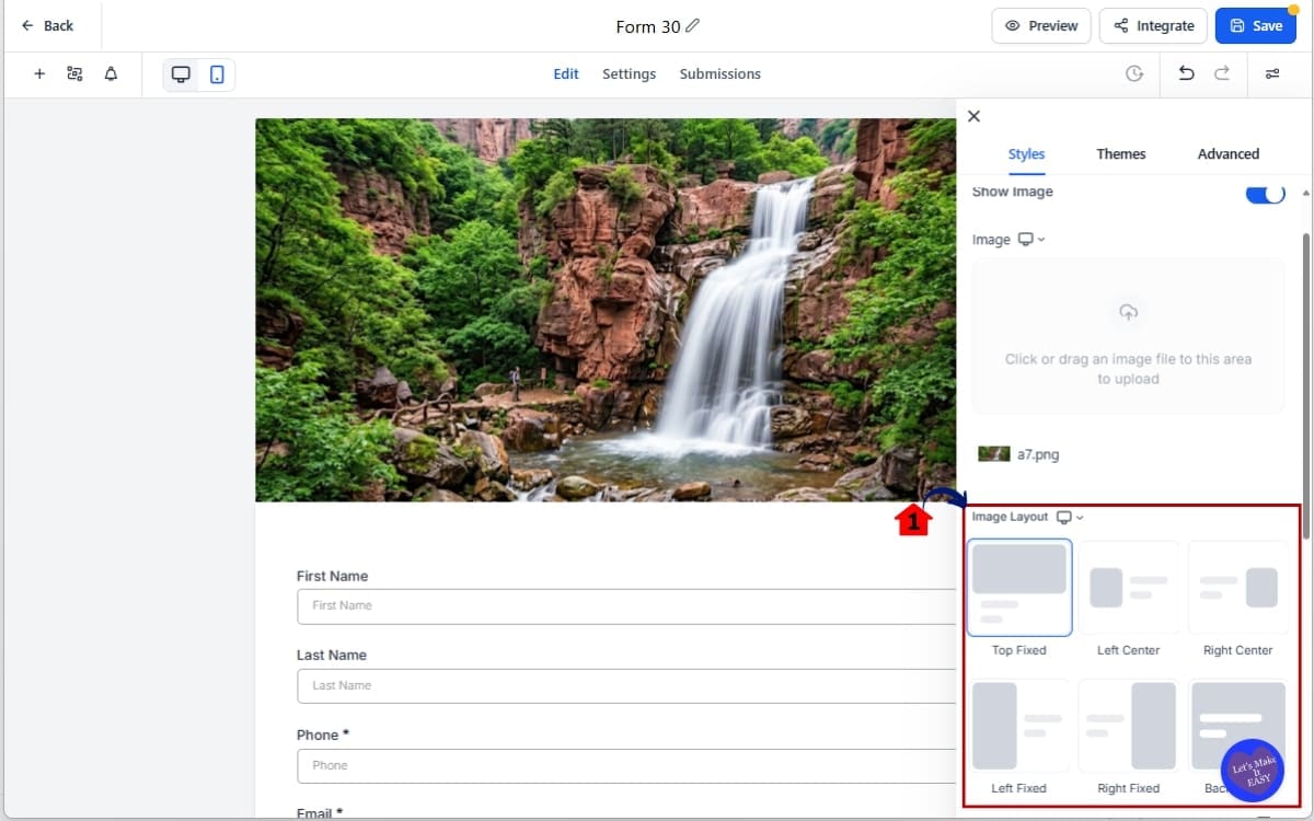
Step 03 – Choose Your Image Layout in styles
3.1 Under Image Layout, select one of the following:
- Top fixed
- Left Center
- Right Center
- Left Fixed
- Right Fixed
- Background
The layout you select determines which customization controls become available. Choose carefully based on what you need.
Step 04 – Adjust Layout-Specific Settings of the images
- If you selected Left Center or Right Center:
4.1 Adjust “Image Corner Radius.”
- Increase it for rounded edges and Set to zero for sharp edges
4.2 Adjust “Image-Field Spacing.”
- Increase spacing for a cleaner, more open look and Reduce spacing for a tighter layout
This ensures faces, logos, or products stay centered even when screen sizes change.
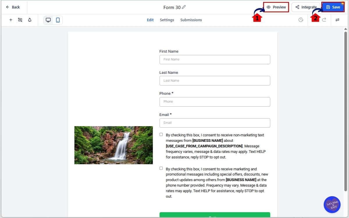
Step 05 – Preview and Test the forms
- Preview and save the forms you added images.
5.1 Click Preview.
- Preview to check if the spacing of the image is good
5.2 Click save
- Save the forms you created.
Make sure:
- Spacing feels balanced
- Important parts of the image remain visible
- The form fields are easy to read
- Nothing feels cramped
Always test before publishing. Image Layout Controls give you flexibility, but clean design still requires intentional choices.
Pro Tips for Using Image Layout Controls
Image Layout Controls give you flexibility. But flexibility without intention creates messy design.
Here’s how to use them properly.
Use Center Layouts for Lead Capture Forms
Left Center and Right Center are ideal for:
- Opt-in forms
- Webinar registrations
- Free download pages
- Simple contact forms
Why? Because they keep the layout balanced while still allowing branding.
Use Image-Field Spacing to create breathing room. Too tight feels cramped. Too wide feels disconnected. Aim for clean separation without making the form feel stretched.
Use Fixed Layouts for Strong Visual Impact
Left Fixed and Right Fixed work best when:
- You’re using bold visuals
- You want image dominance
- You’re highlighting a product
- You’re using a face for emotional connection
Always adjust the Focal Point. If you skip this step, the system may crop your image awkwardly on mobile.
Click the most important part of the image — usually:
- The eyes in a headshot
- The logo in a branded graphic
- The product center
Work with the layout instead of forcing it. Got rounded buttons and smooth edges across your funnel? Add some curve to the image corners. Running a bold, sharp design? Keep those edges tight.
When everything looks aligned, people feel more comfortable. When things look slightly off, they may not know why, but they feel it. Use slide overrides carefully.
Don’t override every slide just because you can.
Use Independent slide-level layouts when:
- The question topic changes
- You want to shift emotional tone
- You introduce a product or testimonial
- You’re moving toward a call-to-action
Visual rhythm keeps users engaged. But over-customizing every slide creates visual chaos. Keep it intentional.
Common Mistakes to Avoid
- Forgetting to adjust Focal Point on Fixed layouts
- Using large spacing that pushes fields too far apart
- Mixing too many layout styles in one survey
- Ignoring mobile preview
Always preview on desktop and mobile before publishing. Design control is powerful. But clean simplicity converts best.
What Image Layout Controls Mean for Your Business
This update isn’t just about design. It’s about perception. And perception affects conversions.
Higher Quality Lead Capture
When your forms look polished, people trust them more. A cramped, poorly cropped form feels rushed. A balanced, intentional layout feels professional. Professional design increases form submissions. Even if nothing else changes.
Better Client Delivery for Agencies
If you build funnels for clients, this matters even more. Clients notice design. They may not understand workflows. They may not care about backend automation. But they see layout immediately.
With Image Layout Controls, you can:
- Align spacing to brand guidelines
- Match image corners to site style
- Create stronger first impressions
That increases client satisfaction. And that increases retention.
Stronger Survey Engagement
Multi-step surveys are powerful for:
- Lead qualification
- Service applications
- Product matching
- Consultation booking
Now you can adjust visuals per slide.
That means:
- Contextual product imagery
- Emotional reinforcement per question
- Visual cues that guide progression
Better engagement means more completed surveys. More completed surveys mean better data. Better data means better sales conversations.
Cleaner Funnel Consistency
Forms and Surveys are rarely standalone. They’re embedded inside funnels, landing pages, and booking flows. Now you can match image alignment and spacing to the rest of the page. That removes visual disconnect.
And visual consistency increases trust. Trust increases conversions. Small layout improvements compound over time.
Real-World Use of Image Layout Controls
Image Layout Controls are not just design tools. They are workflow enhancers.
Here’s how this plays out in real marketing scenarios inside GHL.
Scenario 1: A Common Lead Generation Setup
You’re building a funnel for a free guide.
Instead of stacking the image above the form, you use a Left Center layout.
- Image on the left
- Form fields on the right
- Clean spacing between both
You soften the corners to match your brand style. Now the form looks intentional.
Balanced. Professional. That increases perceived value.
More perceived value = more opt-ins.
Scenario 2: Multi-Step Survey Qualification
You’re qualifying leads before booking calls.
- Slide 1: Brand introduction image
- Slide 2: Service-related graphic
- Slide 3: Testimonial visual
- Slide 4: Strong CTA image
Using Independent slide-level Image Layout Controls, each slide supports the message of that specific question. Instead of one repeated design, you create momentum. Momentum keeps users moving forward. Completion rates improve.
Scenario 3: Agency White-Label Client Builds
You build forms for multiple clients. One client wants sharp, modern styling. Another wants soft, rounded visuals.
With Image Layout Controls, you adjust:
- Corner radius
- Spacing
- Layout type
No workarounds. No CSS hacks. No design compromises. Everything stays inside the GHL builder.
Scenario 4: Product or Offer Highlight Form
You’re running a campaign around a single product. Use a Fixed layout. Set the focal point directly on the product. Even when the screen resizes, the product remains visible. That keeps attention where it matters. When layout supports the offer, conversions follow.
Image Layout Controls FAQs
Final Thoughts on Image Layout Controls
Image Layout Controls inside GHL solve a quiet but important problem. Forms and Surveys worked before. But they lacked flexibility.
Now you have:
- Four new layout options
- Adjustable spacing
- Corner radius styling
- Focal point control
- Slide-level customization in surveys
That’s real design control. And design control directly affects perception.
Cleaner layouts build trust. Better spacing improves readability. Proper image focus keeps attention where it belongs.
If you build funnels, qualification surveys, or client lead capture systems inside GHL, this update gives you sharper execution without extra tools or custom code.
Everything stays inside the builder. Simple to use. Powerful when applied correctly.
Your Next Step
Open one of your active forms. Switch to a Left Center or Right Fixed layout.
Adjust spacing. Set the focal point. Preview on mobile.
You’ll see the difference immediately.
Small upgrades like this compound across every funnel you build.
Have you tested the new Image Layout Controls yet? Which layout do you prefer, Center or Fixed?
Let me know how you’re using them inside your GHL builds.
Scale Your Business Today.
Streamline your workflow with GoHighLevel’s powerful tools.