- New updates give you powerful control over how your forms, surveys, and quizzes look and feel on every device.
- Quick Summary – Responsive Form Builder Essentials
- What’s new in the responsive form builder
- Inline editor upgrades for responsive form builder
- Set mobile and desktop styles separately
- Show different content on mobile screens
- See live previews as you build
- Why responsive form builder updates matter
- How to use the responsive form builder in GHL
- Pro tips for using the responsive form builder
- Why this responsive form builder upgrade matters
- Frequently Asked Questions about the responsive form builder
New updates give you powerful control over how your forms, surveys, and quizzes look and feel on every device.
Why responsive form builder matters now
A responsive form builder is the key to getting more people to fill out your forms, especially on mobile. If the layout feels off or hard to use, most visitors won’t bother finishing it.
Today, more users complete forms on their phones than on desktops. That means your forms need to work well on every screen, not just look good in the editor. If they load slow or break on mobile, your leads drop off.
GoHighLevel’s latest update makes it easier to build forms that work better across devices. You can now set mobile-specific styles, change the text based on screen size, and preview your updates as you build. It’s built for agencies that care about user experience and want better results from their lead capture tools.
No more guessing what your forms will look like on mobile. You now have the control to make every detail count.
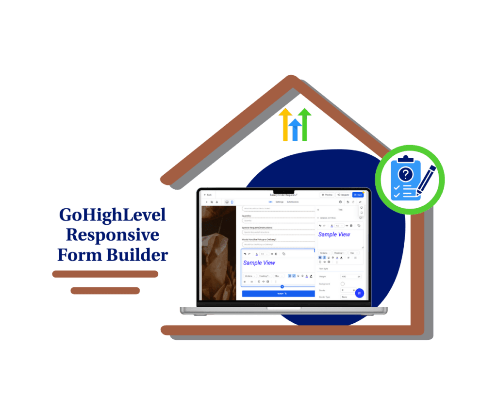
The updated responsive form builder in GHL makes it easy to create forms that look good and work well on every device. You can style content for mobile and desktop separately and get live previews so you know exactly how it will show up. It’s simple, fast, and saves time.
Quick Summary – Responsive Form Builder Essentials
Purpose: This update improves the responsive form builder so you can create forms that look and work better on every screen.
Why It Matters: Most users fill out forms on their phones. Better mobile styling leads to more completions and higher conversion rates.
What You Get: Inline text editing, mobile-specific content options, device-specific styling, and live previews all inside the form editor.
Time To Complete: You can apply these updates in just a few minutes to any new or existing form.
Difficulty Level: Easy. No special training is needed. The features are built into the existing editor.
Key Outcome: Your forms, surveys, and quizzes will look cleaner and perform better on both desktop and mobile.
What’s new in the responsive form builder
The responsive form builder in GoHighLevel just got a solid upgrade. It’s now easier to style your forms and make sure they look right on both desktop and mobile.
You can format your text blocks directly inside the builder. No extra clicks or side menus. Just select your text and adjust the font size, color, or weight as needed. The built-in editor helps you keep your layout clean and easy to read.
Automate marketing, manage leads, and grow faster with GoHighLevel.

This responsive form builder also gives you separate controls for mobile and desktop. You can set different padding, background colors, and font settings based on the device. That means you don’t have to sacrifice design on one screen to make it work on another.
Best of all, the new responsive form builder includes a live preview. As you make changes, you’ll see exactly how your form looks in real time. No more switching tabs or publishing early just to test.
This update is all about clarity and control. It’s designed to help you build forms that feel right no matter what device your visitors are using.
Inline editor upgrades for responsive form builder
The new inline editor in the responsive form builder makes formatting simple. You no longer have to use clunky side panels or click through different menus to change how your text looks.
Now, when you add a heading or text block, you can format it directly on the screen. Change the font size, make words bold, or adjust the color without leaving the builder. It’s all right where you need it.
This small shift saves time and helps keep your layout clean. You can see the changes as you make them, which means fewer mistakes and less rework.
The inline editor works with key form elements like headings, text blocks, and terms and conditions. Whether you’re writing a headline or adding a disclaimer, the responsive form builder gives you full control over the look and feel.
For agencies that care about both speed and design, this update makes a big difference.
Set mobile and desktop styles separately
The responsive form builder now lets you style mobile and desktop views separately. You can control exactly how your form looks on each screen without one version affecting the other.
Inside the responsive form builder, you’ll find a simple device toggle. You can switch between mobile and desktop, then adjust things like padding, font size, background color, and borders just for that device.
This makes your forms easier to read and faster to complete. You can shrink long headlines for mobile or adjust spacing to fit smaller screens. No more guessing if your desktop layout will break on someone’s phone.
Using a responsive form builder like this means fewer drop-offs, more completions, and a better experience for your leads. You’re not just building a form. You’re building the right form for every screen.
Show different content on mobile screens
The responsive form builder now lets you change your message for mobile without affecting the desktop version. This is useful when a headline or placeholder feels too long for a small screen.
With this update, you can create mobile-specific text that’s shorter and easier to read. That means your forms stay clear, no matter what device your leads are using.
To do this, open the responsive form builder, switch to the mobile view, and edit the text. You can adjust headlines, placeholder text, or any message that needs to fit better.
This helps your form feel more natural on mobile, where space is tight and attention is short. Clearer text makes it easier for people to complete your form.
If you want your forms to convert well across all devices, this feature in the responsive form builder will help you get there.
See live previews as you build
One of the best parts of the new responsive form builder is the live preview feature. As you make changes, you can see what your form looks like right away.
You don’t have to switch tabs, refresh pages, or guess how your form will show up on different devices. Everything updates in real time inside the builder.
This makes the responsive form builder much easier to use, especially when you’re adjusting styles for mobile and desktop. You can test colors, spacing, and text changes on the spot and fix anything that feels off.
Being able to preview your work as you go means fewer mistakes and faster edits. It also helps you build cleaner forms that look good and work well on every screen.
With the responsive form builder, what you see is truly what you get.
Why responsive form builder updates matter
The responsive form builder is built to help more people finish your forms. If your layout is messy or hard to read, most users will drop off, especially on mobile.
This update gives you more control over how each form looks on different screens. You can change the layout, spacing, and text for mobile without touching the desktop version. That helps your forms feel more natural and easier to complete.
For agencies, this means better results with less editing. When your forms look good and work well, you avoid the back-and-forth that slows down projects.
The responsive form builder also saves time. You can format text inline, switch views, and preview updates in real time. There’s no need to guess how things will look. You can fix it right away.
A responsive form builder should make your job easier. This one does.
How to use the responsive form builder in GHL
This update is already live inside the Form, Survey, and Quiz builders in GoHighLevel. No extra setup needed. You can start using the responsive form builder right away to customize layouts for mobile and desktop.
Here’s how to get started:
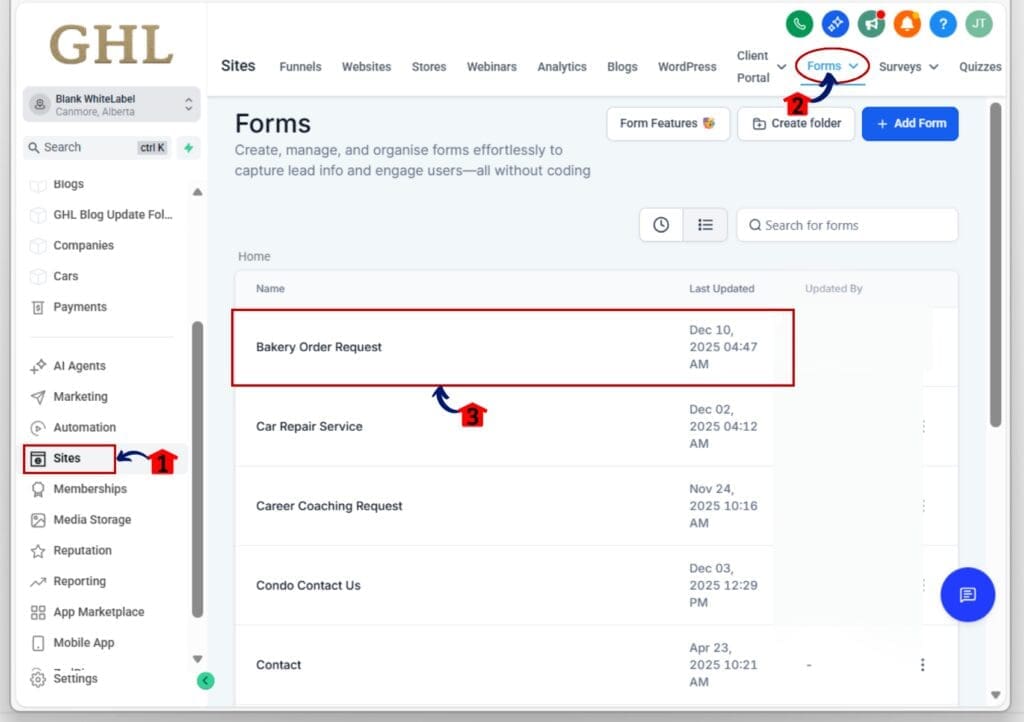
Step 01: Access the Main Left Hand Menu in GoHighLevel
- The Main Menu on the Left side of your screen has all the main areas that you work in when using GHL
1.1 Click on the Sites Left hand Menu Item.
- Access the ‘Sites’ section of GoHighLevel
1.2 Choose the builder you want to work with
- Click “Forms,” “Surveys,” or “Quizzes” to open the builder tool.
- For this demo we will click Forms
1.3 Select an existing form or create a new one
- Either option works. The responsive form builder applies to both.
Step 02: Use the Device Toggle to Switch Views
- This is where the mobile and desktop styling magic happens.
2.1 Add (text, heading, or T&Cs) element on your builder
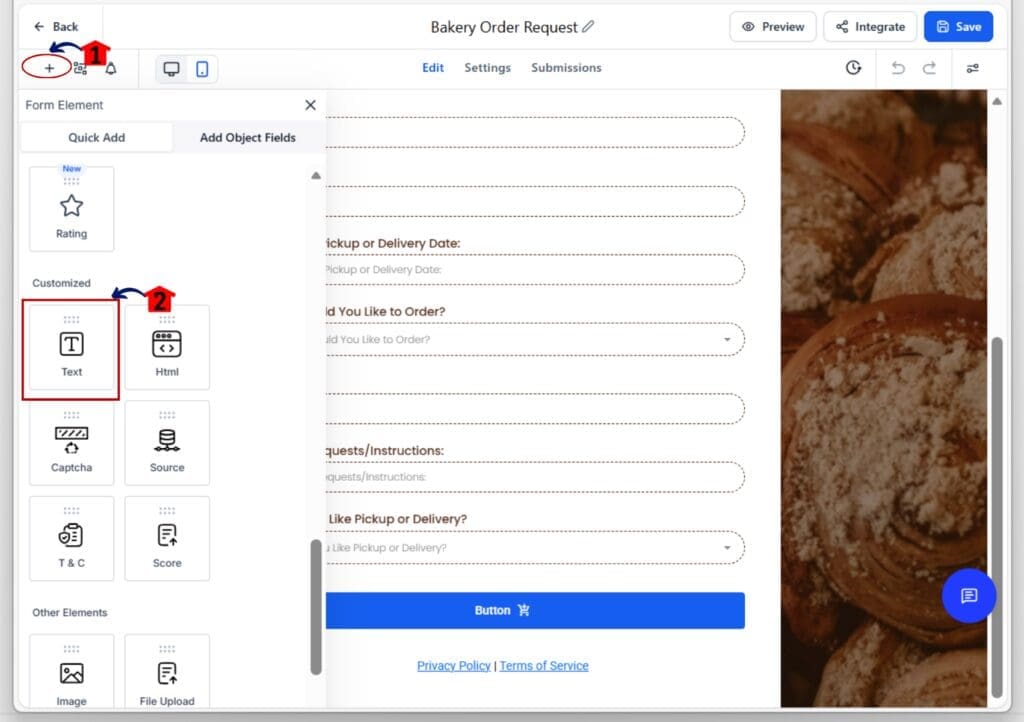
2.2 Click on any content block (text, heading, or T&Cs) you added on the builder
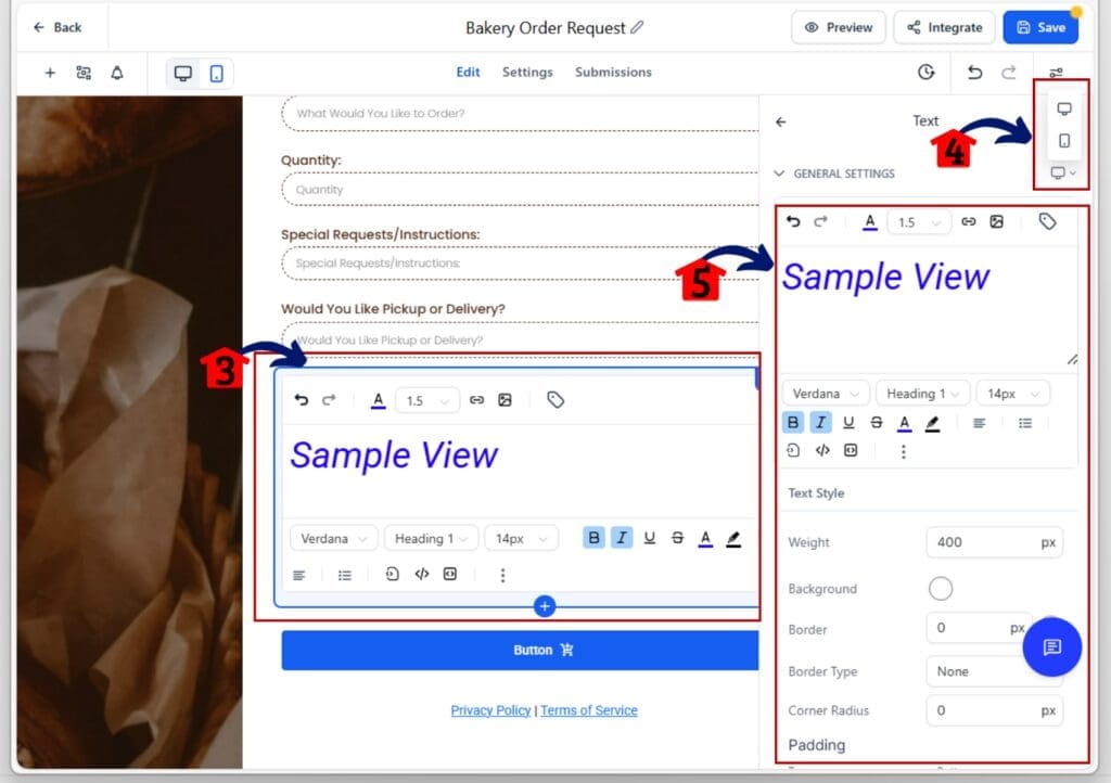
- The right-hand sidebar will display new styling options.
2.3 Use the toggle to switch between Desktop and Mobile views
- You’ll now be editing styles specific to that device only.
2.4 Change padding, font size, background color, and more
- Adjust spacing or styles without affecting the other view.
Step 03: Edit Inline Text for Better Formatting
- The built-in editor lets you format content directly inside the form.
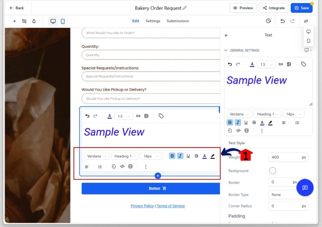
3.1 Select a text or heading block
- A small toolbar will appear above the text.
3.2 Bold, resize, or recolor your text
- No sidebar or settings menu required it’s all inline.
3.3 Repeat for other content blocks as needed
- Use consistent formatting across both device views.
Step 04: Customize Mobile-Specific Text
- Tailor your message for smaller screens.
4.1 Switch to the Mobile view in the device toggle
- This shows you only the mobile version of your form.
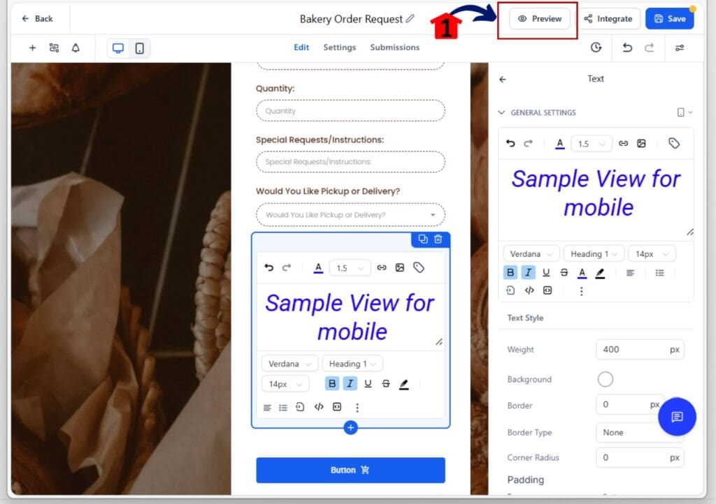
4.2 Update placeholder text or headlines for mobile
- Make your copy shorter or clearer for mobile users.

Step 05: Preview Your Form in Real Time
- You can now see changes as you make them.
5.1 Use the live preview option inside the builder
- The form will update automatically as you edit.
5.2 Switch between views to check both layouts
- Double-check mobile and desktop before you publish.
That’s it. The responsive form builder in GoHighLevel helps you design forms that look and work better on any screen no guesswork, no extra tools.
Pro tips for using the responsive form builder
To get the most out of the responsive form builder, think mobile-first. Most users will see your forms on their phone, so you want things to load fast, look clean, and be easy to complete.
Here are a few simple tips that make a big difference:
Keep mobile headlines short.
- Try to stay under five words. Long text can wrap awkwardly or look cluttered on smaller screens.
Add extra padding around buttons.
- People tap with their thumbs, not a mouse. Make sure buttons have enough space around them so they’re easy to press.
Use light backgrounds and high-contrast text.
- It helps with readability, especially outdoors or in low-light settings.
Write a different text for mobile.
- Use the mobile view in the responsive form builder to rewrite headline or placeholder text so it fits better.
Preview every change.
- The live preview shows you what your form will actually look like. Always check both views before you hit publish.
These small tweaks add. They make your forms easier to finish and more likely to convert.
Why this responsive form builder upgrade matters
This responsive form builder upgrade is about more than design. It’s about giving you the tools to create forms that actually work better on every screen.
You can now adjust layout, text, and spacing for mobile and desktop separately. That means your form can feel right on a phone without messing up how it looks on a laptop.
The responsive form builder also cuts down on mistakes. You can see your edits live and fix issues before anyone fills out the form. Inline text editing and mobile-specific content make the process smoother from start to finish.
If you rely on forms to bring in leads or move people through your sales process, this upgrade helps you do that with less friction. A responsive form builder should make your job easier, not harder. And now it does.
Frequently Asked Questions about the responsive form builder
Scale Your Business Today.
Streamline your workflow with GoHighLevel’s powerful tools.
