- Give your funnel and website buttons a cleaner, more interactive feel.
- Quick Summary – Button Hover Animations at a Glance
- What’s New With Button Hover Animations
- Why Button Hover Animations Matter
- How to Add Button Hover Animations in GoHighLevel
- Quick Tips for Better Button Hover Animations
- Results You Can Expect
- Frequently Asked Questions about Button Hover Animations
- Make Your GHL Buttons Feel More Responsive
Give your funnel and website buttons a cleaner, more interactive feel.
Button Hover Animations Make GHL Buttons Better
Button Hover Animations are now built into the GoHighLevel Funnel and Website Builder, giving you a simple way to make CTA buttons feel more responsive. You can choose from 20 effects, preview them on the page, and adjust the look without touching custom CSS.
The new controls cover things like speed, delay, easing, movement, colour, borders, and shadows. GHL also keeps the setup clean by only showing the settings that apply to the effect you pick, which makes it easier to get the result you want.
For agencies and marketers, Button Hover Animations can help make funnels and websites feel more polished without adding extra work. They also turn off touch devices and smaller screens, so mobile visitors get a cleaner experience.

Button Hover Animations give you a simple way to make GHL buttons feel more responsive and polished. You can add visual feedback, adjust each effect, and improve CTA design without touching custom CSS.
Quick Summary – Button Hover Animations at a Glance
Purpose: This update adds Button Hover Animations to buttons inside the GoHighLevel Funnel and Website Builder, giving you a simple way to add visual feedback without custom CSS.
Why It Matters: Hover effects can make CTA buttons feel more responsive and polished, which helps improve the overall page experience.
What You Get: You can choose from 20 hover effects, preview them before applying, and adjust settings like duration, delay, easing, scale, movement, colour, borders, and shadows.
Time To Complete: Most users can add and adjust a hover effect in about 2 to 5 minutes.
Difficulty Level: Easy. The controls are built into the GHL page builder and do not require coding.
Key Outcome: You can create cleaner, more interactive CTA buttons while keeping the setup simple and consistent across your funnels and websites.
What’s New With Button Hover Animations
Button Hover Animations give you 20 built-in effects to use on buttons inside the GoHighLevel Funnel and Website Builder. You can choose from effects like Grow, Pulse, Rotate, Float, Glow, Shadow, Sweep, Ripple, and more.
Each effect comes with ready-to-use settings, so you do not have to build the animation from scratch. You can also preview an effect by hovering over its card before you apply it. Once selected, GHL lets you adjust the duration, delay, and easing. Extra controls only appear when they are needed, such as scale, angle, distance, colour, border thickness, blur, or spread.
Automate marketing, manage leads, and grow faster with GoHighLevel.

The feature is also designed to behave properly across devices. Hover effects turn off on touch devices and screens under 1024px. If a button already has an entrance animation, the hover effect waits until that animation is finished. This helps keep the page smooth and avoids odd animation conflicts.
Why Button Hover Animations Matter
Button Hover Animations help make your calls to action feel more active and clear. When a visitor moves over a button and sees a small visual change, it confirms that the button is ready to click. That may sound minor, but small details like this can make a funnel or website feel easier to use.
For agencies, this also means less custom work. You can now add polished hover effects inside GHL without writing CSS or using another tool. That makes it easier to keep client pages consistent and make quick design changes when needed.
This works best on key buttons like Book Now, Get Started, Learn More, or Buy Now. The goal is not to animate every button on the page. Use Button Hover Animations where they help guide attention and make the next step feel obvious.
How to Add Button Hover Animations in GoHighLevel
Button Hover Animations in GoHighLevel let you add movement and visual effects to buttons inside the Funnel and Website Builder. The controls are built into the button Animation settings, so you can preview effects and adjust them without using custom CSS.
For our example, we will use a Website as it often is more critical for SEO and first impressions.
Here are the steps we will follow:
- Open Your Website in GHL.
- Open the Page You Want to Edit.
- Select the Button and Open Hover Animation.
- Choose and Adjust the Hover Effect.
To start, make sure you are logged in to the correct GoHighLevel sub-account.
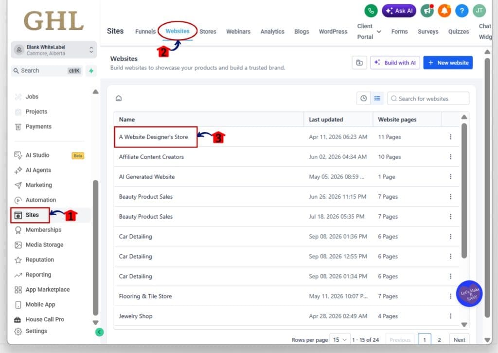
Step 01 – Open Your Website in GHL
- The main menu on the left side of your screen includes the main areas you use in GoHighLevel.
1.1 Click Sites.
- This opens the Sites area in your GHL sub-account.
1.2 Click Websites in the top menu.
- The Websites section will open.
- You will see the websites already created in the sub-account.
1.3 Click the website you want to edit.
- This opens the selected website and its page list.
Step 02 – Open the Page You Want to Edit
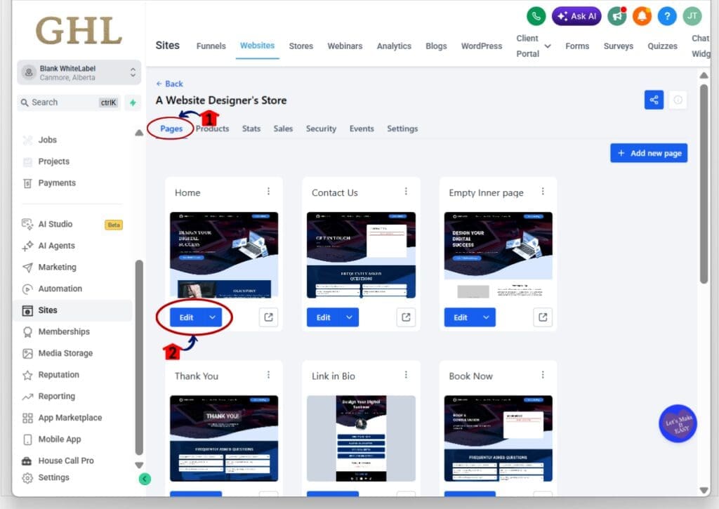
- After opening the website, you will see the pages connected to it.
2.1 Make sure you are on the Pages tab.
- This section shows the pages included in the website.
2.2 Click the Edit button below the page you want to update.
- This opens the page inside the GoHighLevel Website Builder.
- Wait for the page and editing controls to fully load before moving on.
Step 03 – Select the Button and Open Hover Animation
- Once the page builder is open, select the button you want to animate.
3.1 Click the button on the page canvas.
- The button will become the active element.
- Its settings will appear in the right-hand sidebar.
3.2 Click the Animations tab.
- This opens the animation settings for the selected button.
- You will see both Entrance Animation and Hover Animation options.
3.3 Click Hover Animation.
- This opens the hover effect settings for the button.

Step 04 – Choose and Adjust the Hover Effect
- The Hover Animation panel includes the available effects and the controls used to adjust them.
4.1 Review the available hover effects.
- The effects are shown as cards inside the Hover Animation panel.
- You can choose from options such as Grow, Shrink, Bounce In, Rotate, Float, Skew Forward, Wobble Horizontal, Buzz, and more.
4.2 Hover over an effect card to preview it.
- The selected button on the page will show the effect.
- This makes it easy to compare different options before you choose one.
4.3 Click the hover effect you want to use.
- The selected effect will be applied to the button.
4.4 Click Adjust Animation.
- This opens the settings for the selected effect.
- Depending on the effect, you can adjust options such as Duration, Delay, Easing, Scale, Angle, Distance, Fill Colour, Border settings, or Shadow settings.
4.5 Review your button animation on the page.
- Move your cursor over the button to test the effect.
- Make sure the animation feels smooth and does not distract from the call to action.
4.6 Use the Preview option at the top of the builder if you want to check the full page.
- This lets you see how the button behaves in the page experience.
4.7 Click Publish when you are happy with the result.
- Your updated button hover effect will now be included on the published page.

Button Hover Animations are automatically disabled on touch devices and screens under 1024px. If the button also has an entrance animation, the hover effect waits until the entrance animation is complete before it becomes active.
Quick Tips for Better Button Hover Animations
Button Hover Animations work best when they support the button instead of stealing attention from it. For most business pages, simple effects like Grow, Shadow, Glow, or Sweep are a good place to start. They add movement without making the page feel busy.
Keep the timing fairly short, especially on important CTA buttons. A quick effect usually feels more natural than a slow one. You can also use the built-in defaults first, then only adjust Duration, Delay, Easing, or other settings if the effect needs a small tweak.
Try to keep the style consistent across the page. If one button uses a soft Grow effect and another spins or wobbles, the design can start to feel messy. Use Button Hover Animations on the buttons that matter most, such as Book Now, Get Started, Learn More, or Buy Now, and keep the effect subtle enough that the CTA stays easy to read and click.
Results You Can Expect
Button Hover Animations can make your GoHighLevel pages feel more polished and easier to use. Visitors get a clear visual response when they move over a button, which helps important CTAs feel more active and ready to click.
For agencies, the biggest win is speed. You can improve button design without custom CSS, extra plugins, or outside tools. That makes it easier to keep client funnels and websites consistent while making small design changes faster.
You can also expect a cleaner experience across devices. Hover effects turn off on touch devices and smaller screens, while entrance animations finish before hover effects begin. The result is a smoother page with fewer awkward animation conflicts.
Frequently Asked Questions about Button Hover Animations
Make Your GHL Buttons Feel More Responsive
Button Hover Animations give GoHighLevel users an easy way to make CTA buttons feel more polished and responsive. You can choose from 20 effects, preview them in the builder, and adjust the settings without using custom CSS.
The feature also handles the small details well. Hover effects stay off on touch devices, repeated buttons keep the same animation, and entrance effects finish before hover effects begin. That helps keep the page experience smooth.
If you build funnels or websites in GHL, this is worth testing on your main CTA buttons first. Keep the effect simple, match it to the page style, and use it where it helps guide the visitor.
Scale Your Business Today.
Streamline your workflow with GoHighLevel’s powerful tools.