- Why form label alignment matters
- Quick Summary – Form Label Alignment
- What’s New – Element-level alignment controls
- What’s Changed – From global to per-field control
- Why This Matters – UX, mobile, branding improvements
- How to Use Form Label Alignment in GHL
- Pro Tips – Best layout practices for longer forms
- FAQ – Common questions about label alignment
- What This Means for You – Faster builds, better design
- Results You Can Expect – Cleaner forms, higher conversions
- Conclusion – Don’t overlook the small features—they scale big
Why form label alignment matters
You know those little things that bug you when building a form label alignment? Like when every field label sits in the same spot—even when it makes no sense visually?
Yeah, GHL just fixed that.
The new form label alignment setting in GoHighLevel gives you complete control over label positioning for every single field in your forms, surveys, and quizzes. No more wrestling with global settings. No more custom CSS just to move one label to the left. You now decide—field by field—whether a label sits on top, left, right, or follows the form’s default.
If you build forms that look clean, convert fast, and perform well on both desktop and mobile, this update is exactly what you’ve been waiting for.
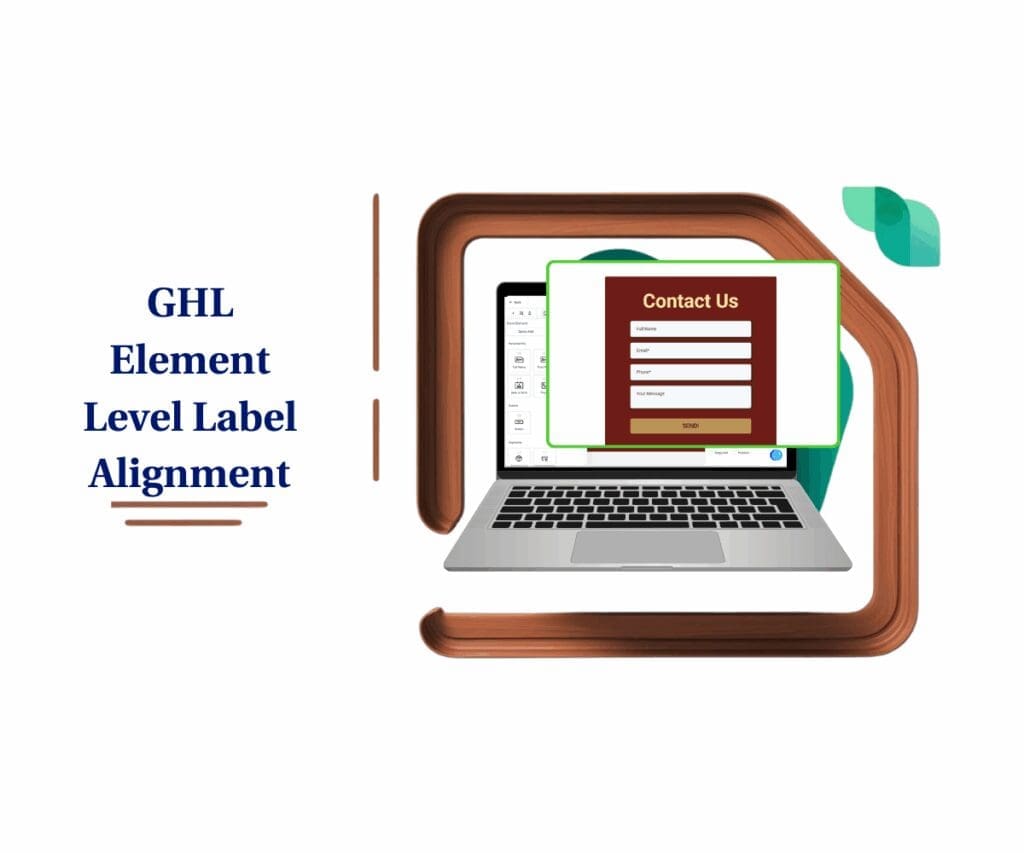
With GHL’s new form label alignment feature, you can align labels per field—left, right, top, or default. This update may seem minor, but it seriously upgrades your form-building flow. It gives you more flexibility, looks cleaner on mobile, and makes it easier to design forms that just work.
Quick Summary – Form Label Alignment
Purpose: This update gives GHL users per-field control over form label alignment, surveys, and quizzes.
Why It Matters: You no longer have to rely on a single global setting or hack together CSS just to move one label.
What You Get: Set each label to left, top, right, or form default—boosting visual control without affecting logic or workflows.
Time to Complete: You can apply new label alignment settings in under 5 minutes per form.
Difficulty Level: Beginner-friendly—no coding or technical experience required.
Key Outcome: Forms look more professional, are easier to scan on mobile, and convert better due to improved layout clarity.
Mobile Optimization: All labels auto-switch to top alignment on mobile for peak readability.
Pro Tip: Use “Form Default” as your baseline, then fine-tune high-impact fields as needed.
What’s New – Element-level alignment controls
GoHighLevel now lets you align each form element’s label individually. That’s right—no more one-size-fits-all global settings. You can choose:
- Left – great for traditional desktop layouts
- Top – ideal for mobile or clean stacked designs
- Right – useful when space is tight or for visual separation
- Form Default – keeps the field aligned with the global setting
Automate marketing, manage leads, and grow faster with GoHighLevel.

This new form label alignment option is available in:
- Forms
- Surveys
- Quizzes
There’s one catch—this currently works only in the Single Column layout, which is still the go-to for clean, mobile-friendly designs.
And speaking of mobile: all fields auto-align labels to “Top” on mobile, no matter your desktop setting. That means you don’t have to worry about tweaking both views. GHL’s already handling that for you.
This change gives you a subtle but powerful edge—especially when working with long forms or layouts that require precise spacing.
What’s Changed – From global to per-field control
Before this update, you were stuck with a single global label alignment setting for your entire form. That meant every field—no matter its type or position—had to follow the same rule.
Need the first name field label on top but the phone field label on the left? Too bad. You’d have to either settle for a layout that wasn’t quite right or mess with custom code.
Now, with form label alignment at the element level, you’re in charge.
Adding a text input? Dropdown? Checkbox? It doesn’t matter—each one lets you set its own label alignment. Just select the field and choose how you want the label to appear.
- Left
- Top
- Right
- Form Default
Want one field to look different? Go for it. You can change how each part looks without throwing off the whole layout. GHL went from one-size-fits-all to fully flexible—just like your agency needs it to be.
Why This Matters – UX, mobile, branding improvements
Let’s be real—good form design is what separates high-converting pages from the ones people bounce off in 3 seconds flat.
The new form label alignment update isn’t just about aesthetics. It’s about control, clarity, and better results.
Here’s why it matters:
- Cleaner UX: Now you can align fields in a way that feels natural to your user. Labels on top for readability, on the left for side-by-side precision, or even on the right for tighter spacing.
- Mobile-first logic: On mobile, all labels default to “Top” automatically. That means better readability, less eye strain, and no surprises on smaller screens.
- You don’t have to pick between a clean layout and having control anymore. Now, you can have both without making trade-offs.
- Stronger branding: If you’re white-labeling GHL for clients, these small layout tweaks can make your forms look completely custom—without custom code.
This kind of update may seem small at first—but for teams managing multiple forms across brands and use cases, it’s a game changer.
How to Use Form Label Alignment in GHL
If you’ve ever wrestled with form layouts and wished you could adjust label positions on a field-by-field basis, your wish is now reality. GoHighLevel’s new form label alignment feature gives you complete design control—without needing to mess with CSS or global settings.
Whether you’re designing a quick lead gen form or a detailed client survey, you can now decide where each label lives: left, top, right, or inherited from the global default. Here’s exactly how to use it:
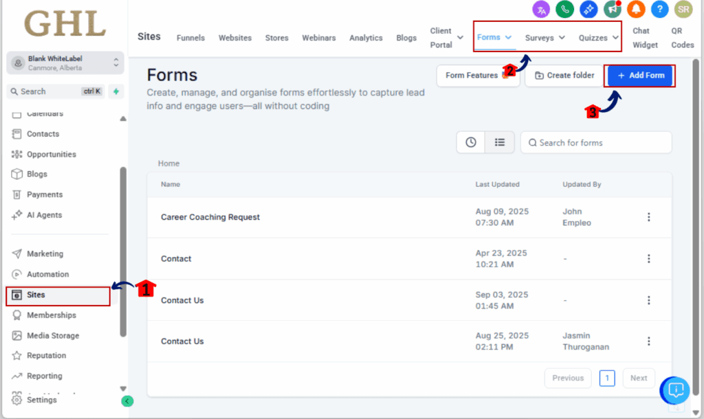
Step 01 – Open the Form, Survey, or Quiz Builder
1.1 From your GHL account, click on “Sites” in the main menu.
1.2 Choose the type you need—Form, Survey, or Quiz.
1.3 From there, you can jump into one you’ve already made or spin up a new one using the Single Column layout.
Step 02 – Select the Form Field You Want to Edit
2.1 Click directly on the field—text, dropdown, checkbox, anything you’ve added.
2.2 The field’s customization options will slide in on the right side.
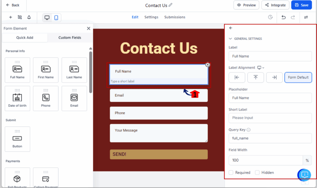
Step 03 – Find the Label Alignment Setting
3.1 In the field settings, scroll to find the “Label Alignment” dropdown.
3.2 You’ll see these four options:
- Left
- Top
- Right
- Form Default
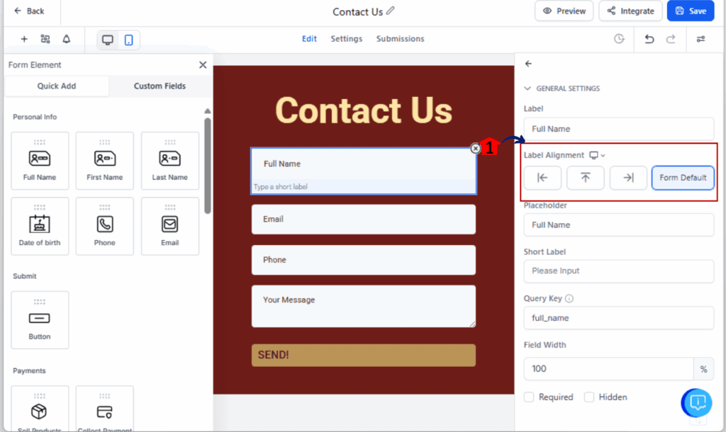
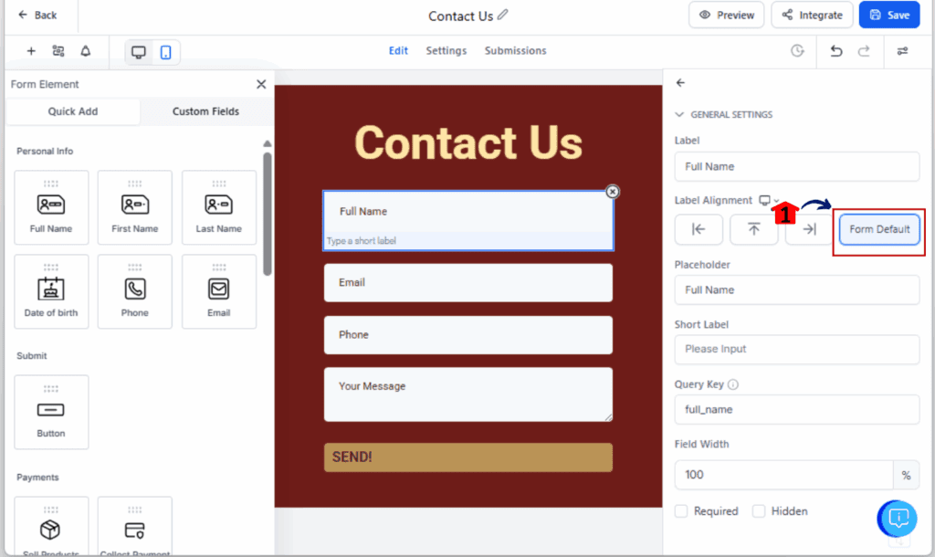
Step 04 – Choose Your Alignment Option
4.1 Select the position you want for that field’s label.
4.2 Use “Form Default” if you want it to inherit the global form setting.
Step 05 – Save and Preview on Desktop + Mobile
5.1 Once everything’s set, save the form.
5.2 Click the preview option to see how it comes together across devices.
5.3 On mobile, labels will always display on top—this is automatic for readability.
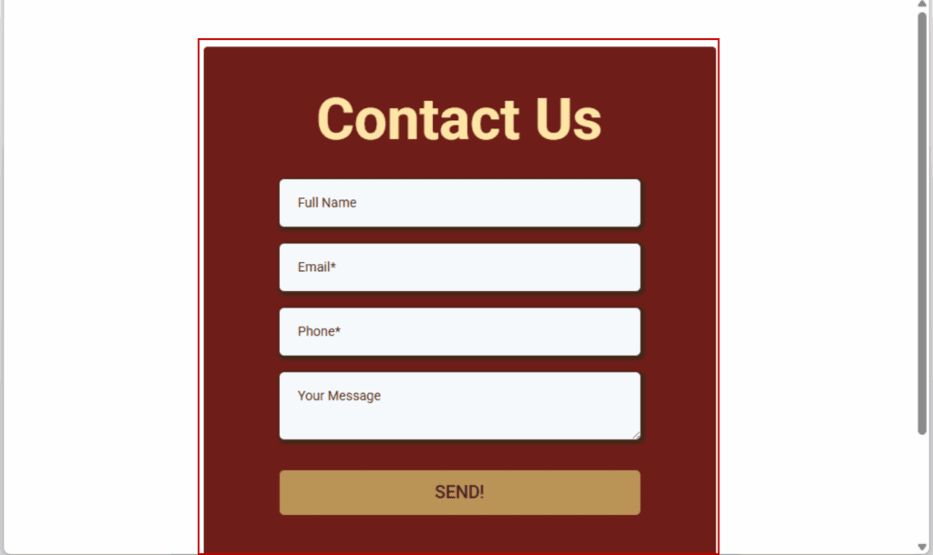
And that’s it. You now have precise layout control without sacrificing speed or mobile-friendliness.
Pro Tips – Best layout practices for longer forms
Want your forms to look sharp and convert better? Don’t just flip form label alignment settings at random. Here’s how to make the most of form label alignment in real-world use cases:
Use “Top” for mobile-first layouts
This is already the default for mobile—and for good reason. Labels on top are easier to scan on small screens. If your audience is mobile-heavy (and let’s be real, most are), lean into this format even on desktop for consistency.
Use “Left” for multi-field sections
Got two or more fields side-by-side? Like “First Name” and “Last Name”? Use left-aligned labels to save vertical space and keep things tight. This works great for billing forms, profile updates, or anything compact.
Use “Right” only when it serves the design
Right-aligned labels are rare—but they can work well when paired with long field names or when you’re trying to visually separate labels from inputs in narrow containers.
Use “Form Default” to stay consistent
Want to keep 80% of your form uniform? Set a global default and override only when a specific layout needs tweaking. This reduces visual noise while giving you flexibility.
Avoid label flipping mid-section
Switching from left to top to right every few fields is jarring. Stick to one alignment per section unless there’s a clear UX reason to change.
Test everything on mobile
Don’t just assume your desktop-perfect design looks good on phones. Always preview on mobile—even though GHL forces Top alignment on smaller screens, it’s still worth double-checking spacing and readability.
FAQ – Common questions about label alignment
Even though it’s a simple feature, there are a few things users often ask when trying out form label alignment in GHL. Let’s clear them up:
What This Means for You – Faster builds, better design
This update isn’t just about label positioning. It’s about removing friction—for you and your users.
For GHL agencies and SaaS resellers, every second saved in the form builder is time you can spend landing more clients or scaling accounts. With form label alignment, you no longer need custom CSS workarounds or cloning hacks just to fix a misaligned label. Now, it’s click, choose, done.
Here’s the real impact:
- You build faster – No more jumping back and forth to global settings or cloning templates for small design tweaks.
- You design better – Each field can now serve a visual and functional purpose without clashing with your layout.
- You stay flexible – Whether you’re building white-labeled surveys for a dental clinic or quizzes for a fitness coach, you can now adjust layout per use case.
The best part? It’s already built to work perfectly on mobile—no testing or coding needed. Your forms just look good, period. If you’re working with clients or running SaaS at scale, this kind of small tweak saves serious time and cuts down on revisions.
Results You Can Expect – Cleaner forms, higher conversions
Sure, it’s just a label shift—but when it comes to forms, that kind of detail can mean the difference between getting a lead and getting ignored.
Here’s what you can expect when you start using form label alignment strategically:
- More polished, professional forms – When labels are placed intentionally, your forms look like they were custom-built—not slapped together.
- When labels are easy to follow, people don’t second-guess what they’re typing. That means fewer mix-ups and cleaner data.
- Mobile users don’t want to hunt for what a field means. Top labels solve that—fast, clean, and easy to tap through.
- When a form’s easy to fill out, people are way more likely to finish it. That means more leads, better onboarding, and higher survey response rates.
- Brand consistency – For agencies white-labeling GHL, this gives you pixel-level control to match your clients’ design standards.
Bottom line? Form label alignment gives you control, clarity, and conversions—all in one click.
Conclusion – Don’t overlook the small features—they scale big
Sometimes it’s the quiet updates that make the biggest impact—and form label alignment is one of them.
By giving you per-field control over label positioning, GoHighLevel just saved your team hours of layout frustration, made your forms more mobile-friendly, and gave your agency or SaaS more power to deliver polished, professional results.
This isn’t just a cosmetic upgrade. It’s a workflow upgrade.
So here’s your move:
- Open your most-used forms
- Check if any label placements could be improved
- Make a few tweaks
- Ship it
And if you’re building for clients? Go update one of their clunky forms and show them the before-and-after. You’ll look like a genius—for something that only took two clicks.
Scale Your Business Today.
Streamline your workflow with GoHighLevel’s powerful tools.