- How to use the new Border controls for cleaner, more custom page designs in GHL
- Quick Summary – Border controls Essentials
- What’s Improved in Border controls
- Why This Matters to You (Border controls)
- How to Use the New Border controls in GHL Page Builder
- Pro / Quick Tips for Better Border controls
- What This Means for Your Business (Border controls)
- Frequently Asked Questions about Border controls
- Conclusion: Border controls
How to use the new Border controls for cleaner, more custom page designs in GHL
Border controls are now easier to fine-tune
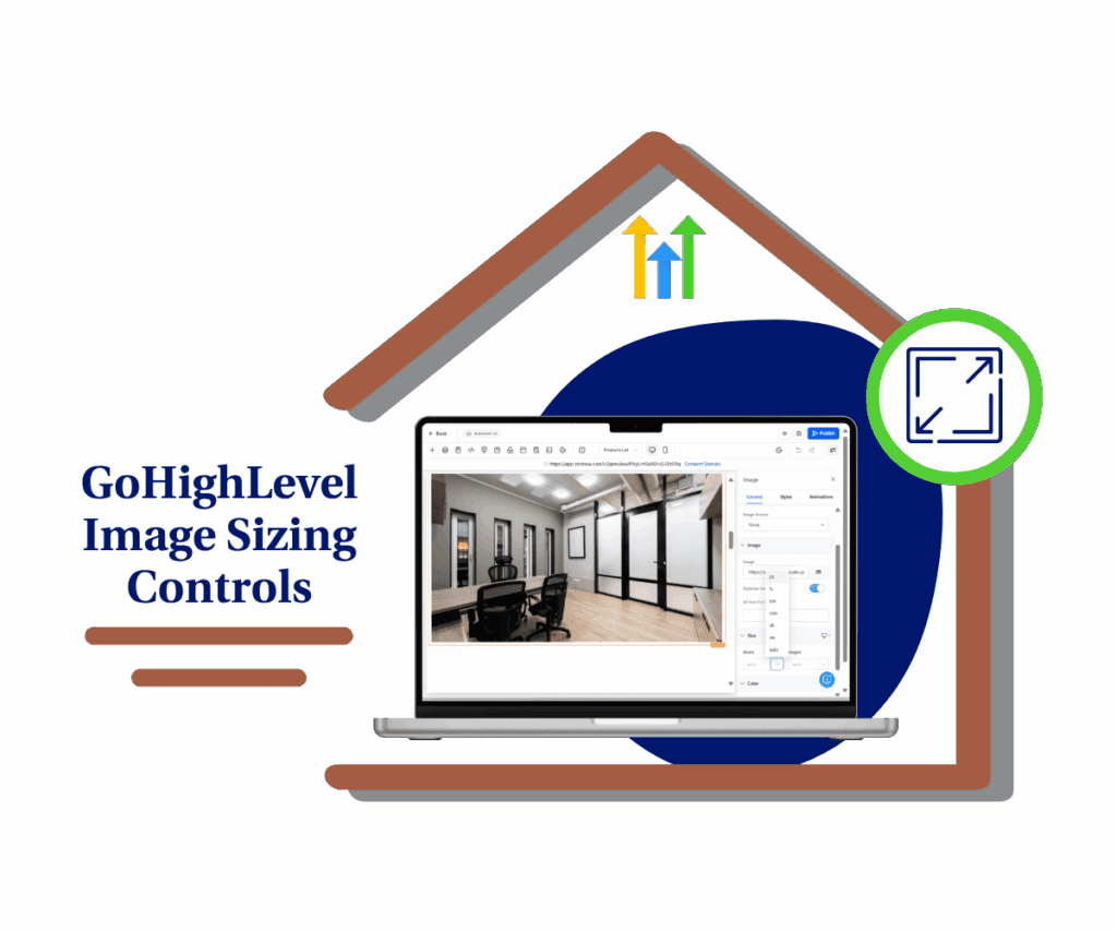
Border controls in GoHighLevel just got a real upgrade, and you’ll feel it the next time you build a page. If you’ve ever clicked around looking for the “right” border setting, you know how annoying that can be.
Now the Page Builder uses one improved Border section across supported elements. You can set border width for each side, set border radius for each corner, and choose from more border styles like double, groove, ridge, inset, and outset. It’s cleaner, more consistent, and easier to repeat across a full page.
The nice part is you do not have to worry about old work breaking. Pages that used the older border settings will keep working as-is, while you get better Border controls for anything you edit moving forward.

With the new Border controls, you can fine-tune page element borders by side and corner, create cleaner designs faster, and keep your older GHL pages working without rework.
Quick Summary – Border controls Essentials
Purpose: This guide shows you how to use the updated Border controls in GoHighLevel Page Builder to style elements with more precision and less hassle.
Why It Matters: Cleaner borders and consistent corner rounding make pages look more professional, which helps visitors trust the page and take action.
What You Get: You can set border width per side, border radius per corner, and use new border styles like double, groove, ridge, inset, and outset from one improved Border section.
Time To Complete: Most updates take 10 to 20 minutes per page once you know where the settings are.
Difficulty Level: Easy. If you can open a page and click an element, you can use these Border controls.
Key Outcome: Your funnels and websites will look more consistent and polished, and you can make design changes faster without risking older page designs.
What’s Improved in Border controls
Border controls are now built for the way people actually design pages. Instead of fighting the old settings, you get one improved Border section that feels the same across supported elements in the Page Builder.
First, you can set border width per side. That means you can make only the top border thicker for a clean section divider, or add a left border to create a simple “highlight bar” style on a text block. No more settling for “all sides the same” when that is not what your layout needs.
Automate marketing, manage leads, and grow faster with GoHighLevel.

Second, you can set border radius per corner, not just one radius for the whole element. This is great for modern card designs, tab-style sections, and button blocks where you want one side rounded and the other side squared. You also get five extra border styles: double, groove, ridge, inset, and outset. These help you create subtle depth or stronger callouts without adding extra elements. And if you have older pages built with the previous border settings, they will still work correctly.
Why This Matters to You (Border controls)
Border controls matter because design details affect trust. When a page looks clean and consistent, people stay longer, read more, and click more. When borders look uneven or random, the page feels off, even if the copy is good.
This update also saves time. Per-side width and per-corner radius means you can build common layouts faster. Think pricing cards, feature boxes, FAQ sections, and callout blocks. You can create those looks with simple settings instead of extra elements or custom CSS.
It also makes teamwork easier. If you have a VA, a designer, or a junior builder editing pages, a consistent Border section reduces mistakes. And since older pages still keep their original settings, you can improve new builds without risking the styles on pages that are already live.
How to Use the New Border controls in GHL Page Builder
The new Border controls are used inside the Website and Funnel Builder while editing a page. You’ll click an element, open the Border section in Style settings, then set border width, radius, style, and color.
Here are the steps to update borders using the improved Border controls in GoHighLevel.
- Access the Funnel or Website page inside GHL Sites.
- Open the Page Builder for the page you want to edit.
- Select an element that supports Border controls.
- Open the Border controls section.
- Set border width per side.
- Set border radius per corner.
- Choose border style and border color.
- Preview and publish the page.
To start make sure you are logged in to your GoHighLevel sub-account.
Step 01 – Access the Funnel or Website page inside GHL Sites
- The Main Menu on the left side of your screen has all the main areas that you work in when using GHL.
1.1 Click Sites main menu item.
- This opens the Sites section where you can access Websites, Funnels, Stores, and more.
1.2 Click Funnels or Websites.
- If you are editing a funnel step, choose Funnels.
- If you are editing a main website page, choose Websites.
- This opens the list of Funnels or Websites you can edit.
1.3 Click the Funnel or Website name you want to update.
- For our example we will use a Website.
- This opens the pages list for that Website.

Step 02 – Open the Page Builder for the page you want to edit
2.1 Find the page you want to update.
2.2 Click Edit for that page.
- The Page Builder will load for that page.

Step 03 – Select an element that supports Border controls
3.1 Click the element you want to style.
- Start with a Section, Row, Column, Button, or Image container.
3.2 Look for the element settings panel on the left.
- This is where you will find Style settings for that element.

3.3 Click the Style settings for the element.
- You should now see styling sections like Spacing, Background, Border, and more.

Step 04 – Open the Border controls section
4.1 Scroll in Style settings until you see Border.
4.2 Click Border to expand the panel.
- This opens the improved Border controls area for that element.
4.3 Confirm you can see options for width, style, color, and radius.
- If you do not see Border, try clicking a different element that supports borders.

Step 05 – Set border width per side
5.1 Find the border width controls.
- If the sides are linked, all sides will change together.
5.2 Turn on per-side control if you see a link or unlink option.
- This lets you change Top, Right, Bottom, and Left separately.
5.3 Set the border width for the side you want to change.
- For a clean divider, set only the Top border width.
- For a callout style, set only the Left border width.
5.4 If you want a full outline border, set all four sides to the same number.
- This creates a consistent border around the element.

Step 06 – Set border radius per corner
6.1 Find the border radius controls.
- If corners are linked, all corners will round the same amount.
6.2 Turn on per-corner control if you see a link or unlink option.
- This lets you set Top Left, Top Right, Bottom Right, and Bottom Left separately.
6.3 Set radius values for the corners you want to round.
- For a card look, round only the top corners.
- For a modern block style, round only one side.
6.4 Keep the radius consistent across similar elements.
- This helps the page feel clean and intentional.

Step 07 – Choose border style and border color
7.1 Open the border style dropdown.
7.2 Select the style you want to use.
- You can use solid or dashed, or try the newer styles like double, groove, ridge, inset, and outset.
7.3 Set the border color.
- Use a brand color for accents or a light gray for clean layout borders.
7.4 If a border style looks too heavy, reduce the width and lighten the color.
- These styles look best when they are subtle.

Step 08 – Preview and publish the page
8.1 Preview the page on desktop.
- Make sure the border looks clean and lines up with spacing.
8.2 Switch to mobile preview and check border thickness.
- Borders can feel too thick on mobile if the width is high.
8.3 Click Save, then publish or update the page.
- Your Border controls changes will now be live.

Pro / Quick Tips for Better Border controls
Border controls can make a page look clean fast, but only if you use them with some discipline. If every box has a border, nothing stands out. Use borders to guide the eye, not to decorate everything.
A simple win is using one-side borders as dividers. Set a top border on a section to separate content, or a left border on a text block to create a quick “note” style. It’s faster than adding extra elements, and it stays consistent when you duplicate sections.
When you test new Border controls, keep things tight. Pick one or two border widths and reuse them. Keep the corner radius consistent across the page. If you try groove, ridge, inset, or outset, go thin and use lighter colors. And always check mobile before you publish because thick borders can look clunky on a small screen.
What This Means for Your Business (Border controls)
Border controls might sound like a small design detail, but they affect how “finished” your pages feel. When your borders are consistent, your pages look more professional. That makes it easier for visitors to trust the offer, and it makes clients trust your work.
For agencies, this also means faster builds and faster edits. You can create clean pricing boxes, feature sections, and callout areas without extra blocks or custom CSS. When a client asks for a “quick polish,” you can fix spacing, borders, and corners in minutes instead of rebuilding sections.
It also helps with team handoff. If a VA or designer jumps into a page, they are more likely to make clean changes because the Border controls work the same way across supported elements. And since older pages keep working with their original border settings, you can improve new pages without worrying about breaking old ones.
Frequently Asked Questions about Border controls
Conclusion: Border controls
Border controls are now easier to fine-tune, and that’s a real win if you build pages often. You can set border width per side, round corners individually, and use the new border styles when you need a little extra emphasis. It’s all in one consistent Border section, so editing feels more predictable.
This update also keeps things safe. Older pages built with the previous border settings will still display correctly, so you can improve new designs without worrying about breaking live pages.
Now do a quick test on one active funnel or website page. Pick one section, tighten up the borders, check mobile, then publish. Small changes like this make your pages look more polished, and that helps conversions.
Scale Your Business Today.
Streamline your workflow with GoHighLevel’s powerful tools.