- The new editor makes it easy to style your post-submit message, preview changes live, and get it looking great on both desktop and mobile.
- Quick Summary – Form Confirmation Design Essentials
- What’s New in the Form Confirmation Design Editor
- How to Use the New Form Confirmation Design Tools in GHL
- Why Your Form Confirmation Design Deserves Attention
- Simple Tips to Improve Your Form Confirmation Design
- Frequently Asked Questions about the new submit message editor
- Turn every submission into a brand moment
The new editor makes it easy to style your post-submit message, preview changes live, and get it looking great on both desktop and mobile.
Why form confirmation design matters more than ever
Form Confirmation Design That Doesn’t Get Ignored
Form confirmation design is one of the easiest parts of your funnel to overlook.
But it’s also one of the most important. It’s the last message someone sees after they take action. Whether they’ve booked a call or filled out a quiz, that message tells them what to expect next. And if it’s not clear or on-brand, it creates confusion or feels unfinished.
GoHighLevel just gave this step a much-needed upgrade. You can now write cleaner messages, format them the way you want, and see exactly how they’ll look on desktop and mobile.
Let’s walk through what changed, how to use it, and why it’s worth updating every form you have.
Rich text editor, layout styling, and live preview
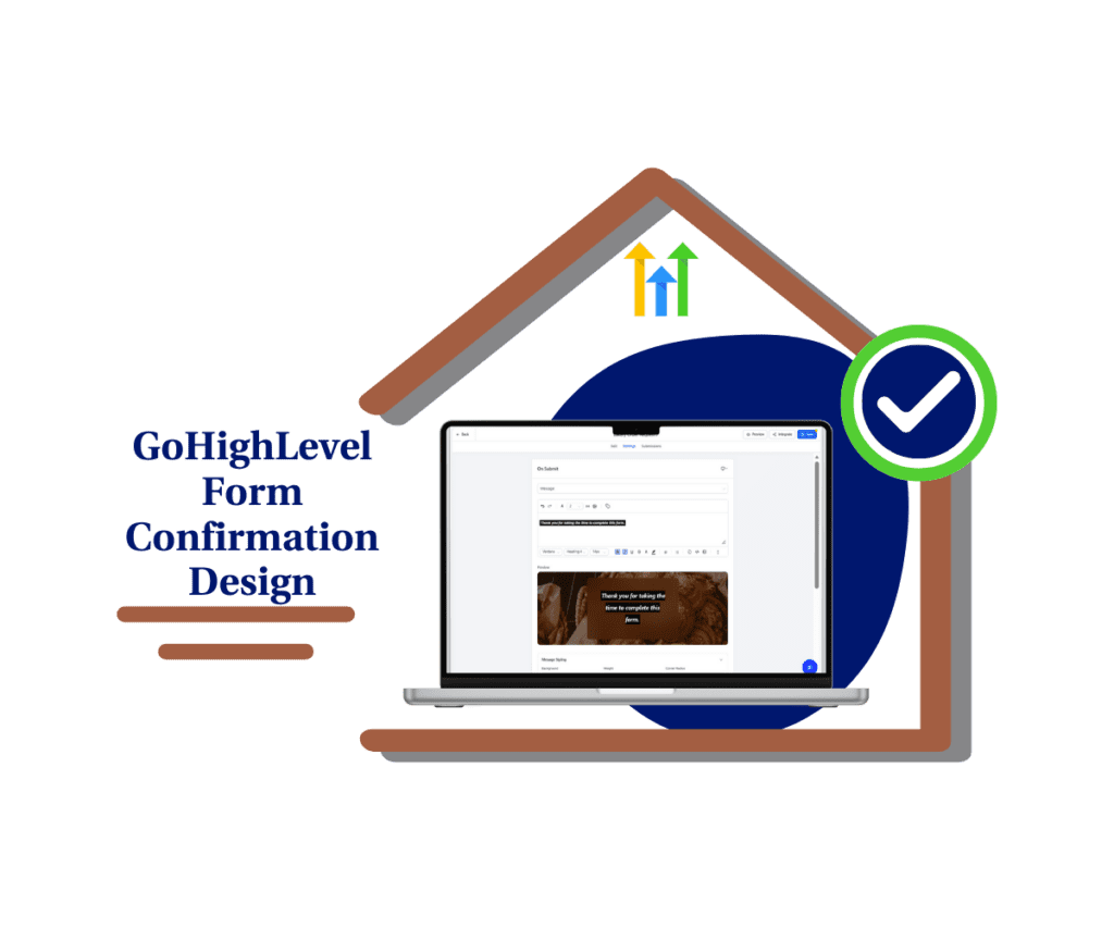
GHL’s form confirmation design tools now give you more control. Write a clear message, preview it live, and make sure it looks good on any screen.
Quick Summary – Form Confirmation Design Essentials
Purpose: The new form confirmation design tools in GHL help you create clear, styled messages that show up after someone submits a form, survey, or quiz.
Why It Matters: This update improves the final step of your form flow, giving you more control over how your brand communicates with leads.
What You Get: A rich text editor, mobile-specific layout controls, background styling, and live preview all built into the submit message editor.
Time to Complete: Most updates take less than 10 minutes per form. No coding needed.
Difficulty Level: Beginner friendly. If you can format a Google Doc, you can use this tool.
Key Outcome: Better form confirmation design that looks clean on all devices and leaves a strong final impression.
What’s New in the Form Confirmation Design Editor
GoHighLevel just rolled out big improvements to how you control your form confirmation design. If you’ve ever felt stuck with a plain or clunky message after someone submits a form, this update fixes that.
Here’s what you can now do inside the editor:
Automate marketing, manage leads, and grow faster with GoHighLevel.

Write and format text easily
- The new editor gives you more freedom with your message. You can bold important parts, add colors, use different font sizes, and even throw in emojis. You now have full control over your form confirmation design without touching code.
Add a headline and subtext
- Instead of dumping everything into one block, you can split your message into a clear headline and supporting text. This makes your form confirmation design easier to read and faster to understand.
Tweak your background settings
- Use the new blur option to soften your background image or choose a solid color if you want a cleaner look. You can even go with a transparent background and just let your text float over the image.
Adjust the layout for desktop and mobile
- Your form confirmation design can now be styled differently for each device. Set different padding, font size, spacing, and layout based on how it will be viewed. No more messages that look great on desktop but don’t fit on a phone.
Preview your changes live
- The live preview shows exactly what your form confirmation design looks like as you edit it. No guessing. No clicking back and forth to test it.
These updates give you more control and let you build a better experience for every lead who completes a form, survey, or quiz.
How to Use the New Form Confirmation Design Tools in GHL
This update is already live in the Form, Survey, and Quiz builders inside GoHighLevel. No setup needed. You can update your form confirmation design right now with just a few clicks.
Here’s how to get started:
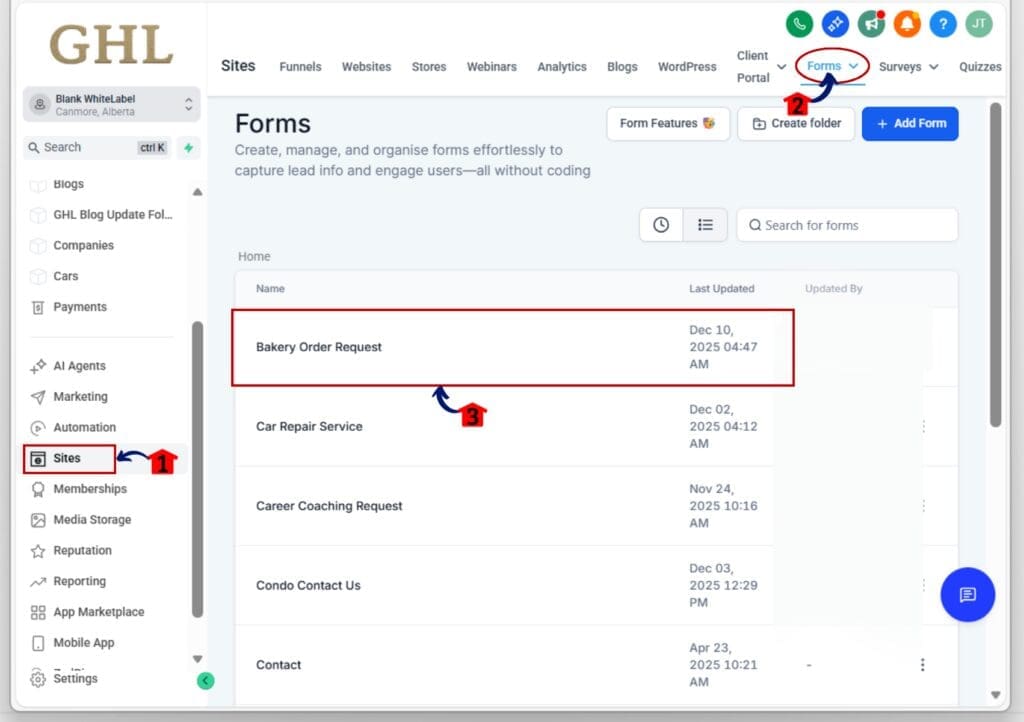
Step 01: Access the Main Left Hand Menu in GoHighLevel
- The Main Menu on the Left side of your screen has all the main areas that you work in when using GHL
1.1 Click on the Sites Left hand Menu Item.
- Access the ‘Sites’ section of GoHighLevel
1.2 Choose the builder you want to edit
- Click “Forms,” “Surveys,” or “Quizzes.” For this example, we’ll select “Forms.”
1.3 Select the form you want to update
- Open an existing form or create a new one. The form confirmation design editor works with both.
Step 02: Access the New Confirmation Message Settings
- This is where the new styling tools live.
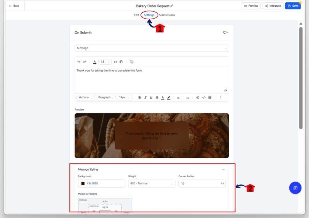
2.1 Go to the “On Submit” tab
- At the top of the form editor, click on the “On Submit” tab.
2.2 Scroll down to Find “Message Styling”
- This is where you can design the form confirmation
Step 03: Write and Style Your Message
- Now it’s time to craft a better message.
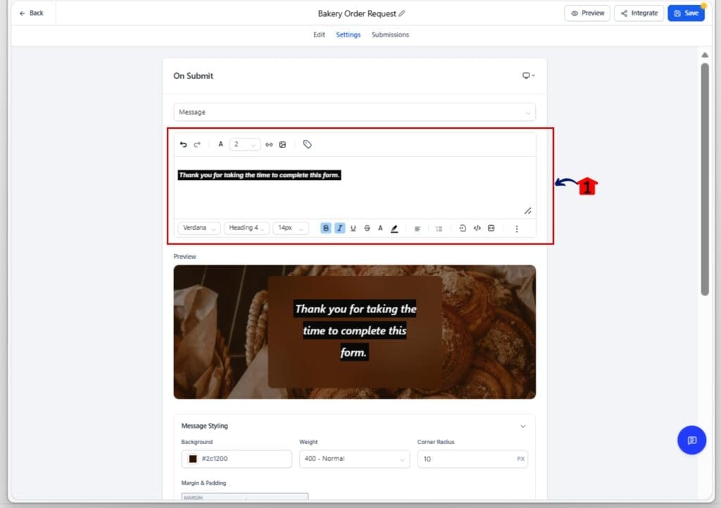
3.1 Add a headline and subtext
- Split your message into a clear title and short follow-up line.
3.2 Use the rich text editor
- Bold your text, change the font size, add color, or include emojis. Everything is inline.
3.3 Format it for clarity
- Keep it simple and focused. Make sure it reads well and looks good.
Step 04: Customize the Look and Layout
- This is where your design choices come in.
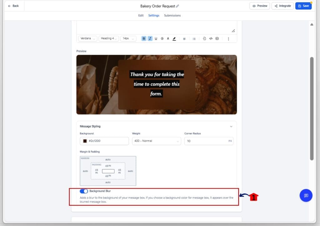
4.1 Choose your background style
- You can blur the background image, use a solid color, or make it transparent.
4.2 Switch between Desktop and Mobile
- Click the device toggle in the builder to style your form confirmation design for each screen type.
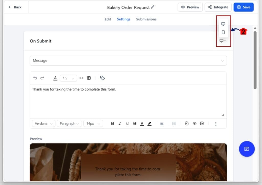
4.3 Adjust padding, spacing, and font size
- Make layout changes specific to each device without affecting the other.

Step 05: Preview Your Design in Real Time
- Make sure everything looks right before you hit save.
5.1 Use the built-in live preview
- Watch your form confirmation design update instantly as you make changes.
5.2 Switch views to check both desktop and mobile
- Double-check spacing, alignment, and readability on both screens.
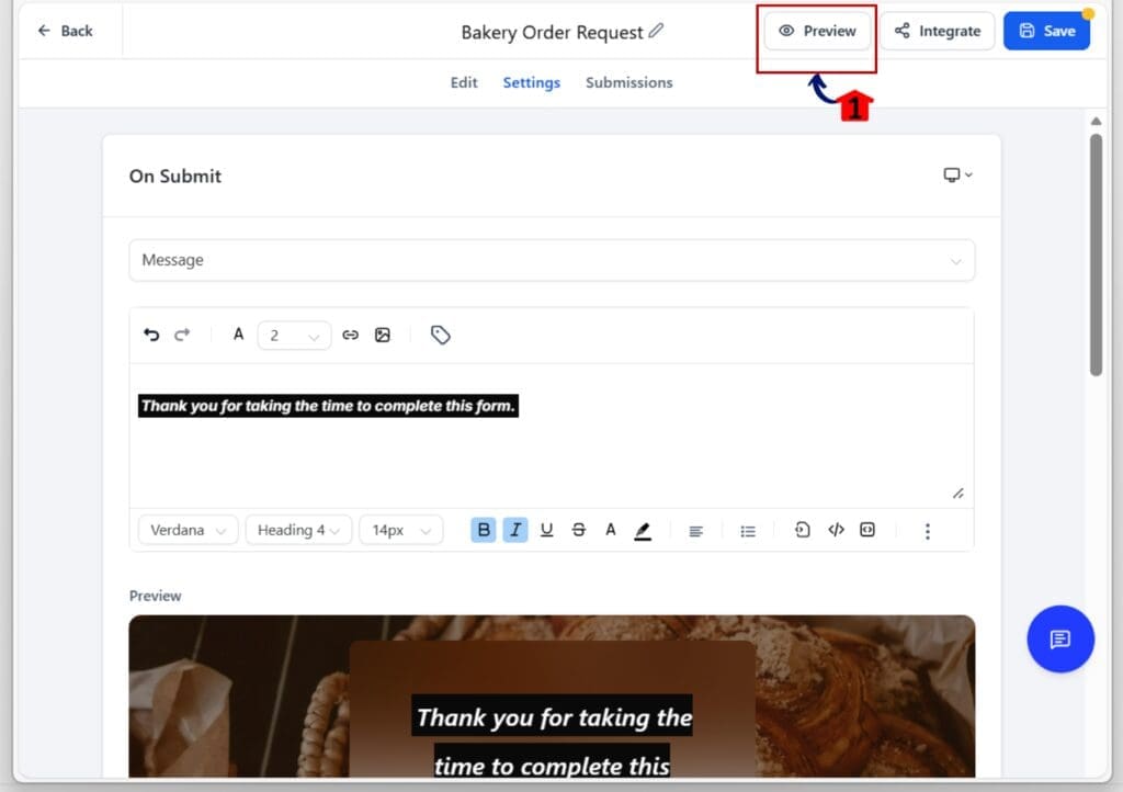
That’s it. GHL’s updated form confirmation design tools make it easier to create messages that are clean, clear, and responsive, no guessing, no hacks.
Why Your Form Confirmation Design Deserves Attention
Form confirmation design often gets skipped or rushed. But it’s the last thing your lead sees after taking action. That message matters.
A clear and well-styled form confirmation design helps people know what to expect next. It also shows that your brand pays attention to detail. A simple “thank you” is fine, but a good message does more. It reassures, guides, and builds trust.
With this update, GoHighLevel gives you the tools to do that with ease. You can write a better message, style it clearly, and make sure it looks good on both desktop and mobile. You don’t need to code or use outside tools.
If your form confirmation design looks messy or hard to read, it leaves people guessing. But if it’s clean, easy to follow, and on-brand, it makes the whole process feel smoother.
This is your chance to finish strong. Whether it’s a form, quiz, or survey, the right form confirmation design helps wrap things up in a simple, professional way.
Simple Tips to Improve Your Form Confirmation Design
A good form confirmation design doesn’t need to be fancy. It just needs to be clear, clean, and easy to read on any screen. Here are a few tips to help you get the most out of the new editor.
Start with a clear message
- Your headline should let people know their form went through. Follow it with a short line that tells them what happens next. Don’t overload it with text. Short and clear always works best.
Keep your tone consistent
- Use the same voice you use on your site or funnel. If your brand is casual, let that show in your message. If it’s more formal, keep your form confirmation design sharp and direct. Stay consistent.
Use formatting to highlight key parts
- Bold important words. Make your headline a little bigger. Use color where it helps the message stand out, but don’t overdo it. The goal is to guide the eye, not create noise.
Design for both mobile and desktop
- Always check both views. Make sure your form confirmation design isn’t too cramped on mobile or too wide on desktop. Use the preview toggle and adjust padding and spacing as needed.
Keep it simple
- You have tools to style the message, but don’t go overboard. Too much color or too many emojis can make it look sloppy. Clean, simple, and readable is the way to go.
Your form confirmation design doesn’t need to impress. It just needs to work and feel like it belongs with the rest of your brand.
Frequently Asked Questions about the new submit message editor
Turn every submission into a brand moment
Form confirmation design is easy to overlook, but it matters. It’s the last thing your lead sees. A clear, helpful message can make your process feel more complete. A confusing one can break the flow.
With the new editor in GoHighLevel, you have more control over how your form confirmation design looks and feels. You can write a better message, format it for mobile and desktop, and see your changes live as you work.
This is a small update with big impact. Taking a few minutes to improve your form confirmation design can make your brand feel more polished. You don’t need to overthink it. Just make sure your message is clear, readable, and fits the tone of your site.
Now is a good time to go back and check your existing forms, quizzes, and surveys. Update the form confirmation design where it feels weak or off brand. Clean it up, keep it simple, and make the end of your form feel just as strong as the beginning.
Scale Your Business Today.
Streamline your workflow with GoHighLevel’s powerful tools.
