- Introduction – Why visual CTAs matter in forms
- Quick Summary – Form Button Icons at a Glance
- What’s New – Button Icon Picker Explained
- What’s Changed – Enhanced Form Design Options
- Why It Matters – UX, Conversions, and Clarity
- How to Use Form Button Icons in GHL Forms
- Pro Tips – Best Practices for Button Icons
- FAQs – Common Questions About Using Button Icons
- What This Means – Agencies & White-Labeling
- Results You Can Expect – Conversion Boosts
- Conclusion – Small UI Tweak, Big Impact
Introduction – Why visual CTAs matter in forms
Let’s face it, most forms are boring. You’ve got a bunch of fields and a lonely little button that says “Submit” or “Send.” That button is your final shot to get the lead, and it’s often the least exciting part of your entire funnel.
That ends now.
With GoHighLevel’s new form button icons feature, you can turn bland CTAs into attention-grabbing, conversion-boosting buttons that look and feel more modern. This simple visual upgrade lets you drop in an icon right next to your button text using GHL’s built-in icon picker.
Not only do icons make your buttons more appealing, they actually help users act faster. A well-placed arrow, checkmark, or symbol gives visual clarity, reinforces the action, and just looks… better.
In this guide, we’ll break down exactly what’s new, how to use it, and why this small design tweak could have a big impact on your form conversions.
This new GHL feature lets you easily add form button icons using a searchable Material Symbols picker, giving your forms a visual upgrade that helps users act faster and convert more often.
Quick Summary – Form Button Icons at a Glance
Purpose: The new form button icons feature lets you visually upgrade your GHL form buttons using built-in, searchable Material Symbols.
Why It Matters: Buttons with icons boost user clarity and reduce friction, leading to faster clicks and better form conversion rates.
What You Get: A searchable icon picker, left/right placement control, and instant preview, all built into the form builder UI.
Time To Complete: Less than 5 minutes to add icons to any form button.
Difficulty Level: Beginner-friendly. No design or code skills needed.
Key Outcome: More polished, higher-converting forms that improve UX and impress clients with minimal effort.
What’s New – Button Icon Picker Explained
GHL just dropped a slick new feature inside the Form Builder: Button Icons. It’s a small toggle with big potential.
You’ll now see a “Show Icon” option when you add or edit a button element in your form. Flip that toggle, and boom, you get access to a powerful icon picker loaded with searchable Material Symbols.
Automate marketing, manage leads, and grow faster with GoHighLevel.

Here’s what’s new:
- Icon Picker Sidebar – A fast, scrollable, searchable interface to find the right symbol for your button.
- Flexible Placement – Want the icon on the left or right side of the text? You decide.
- Live Preview – Every change you make is instantly visible in the form preview. No guessing.
The icon picker uses Google’s trusted Material Symbols, giving you a massive collection of clean, responsive icons that fit any device layout.
This isn’t just a visual upgrade, it’s a quality-of-life feature for anyone who builds forms regularly and wants those forms to feel modern, intentional, and branded.
What’s Changed – Enhanced Form Design Options
Before this update, form buttons in GHL were… well, plain. Text-only, no visual cues, and no way to reinforce what that button actually does. If you wanted something more stylish, you had to hack it with custom code or CSS.
Not anymore.
With the new form button icons, you get a built-in way to make your CTAs pop, no dev skills required.
Here’s what’s different now:
- You can add icons with a simple toggle, no code, no HTML.
- Design flexibility is built in, you choose icon placement (left or right of the button label).
- Instant feedback, everything you change updates in real time in the live form preview.
This change turns every form button into a branding opportunity. You can match the icon to the action, use a paper plane for “Send,” a checkmark for “Submit,” a calendar for “Book Now,” or even a cart icon for purchase flows.
You don’t need a developer to make your clients’ forms look slick anymore, this update makes it easy for any agency or SaaS to step up their design game.
Why It Matters – UX, Conversions, and Clarity
Let’s be real, users are lazy (we all are). If your Form Button Icons doesn’t immediately tell people what to do, they’ll hesitate. And hesitation kills conversions.
That’s where form button icons make a big difference.
Sure, they look good, but icons also help users understand what’s about to happen. Like when you see a checkmark or an arrow:
- A checkmark signals completion
- An arrow implies direction or progression
- A calendar reinforces appointment booking
- A cart supports ecommerce-style actions
The right icon helps people instantly get what the Form Button Icons does, super useful on mobile, where there’s less space and even less patience.
From a UX (user experience) standpoint, icons:
- Speed up decision-making
- Improve accessibility and clarity
- Add professional polish to otherwise boring Form Button Icons
And from a conversion standpoint? Clear buttons lead to more clicks. That simple.
For marketers, designers, and agency owners using GoHighLevel, this is an easy win. No dev time. No complexity. Just better-looking Form Button Icons that help you close more leads.
How to Use Form Button Icons in GHL Forms
If your Form Button Icons still say “Submit” and nothing else, you’re missing a huge opportunity. Want to make your buttons more clear and clickable? You can now drop in icons without breaking a sweat. Let me show you how:
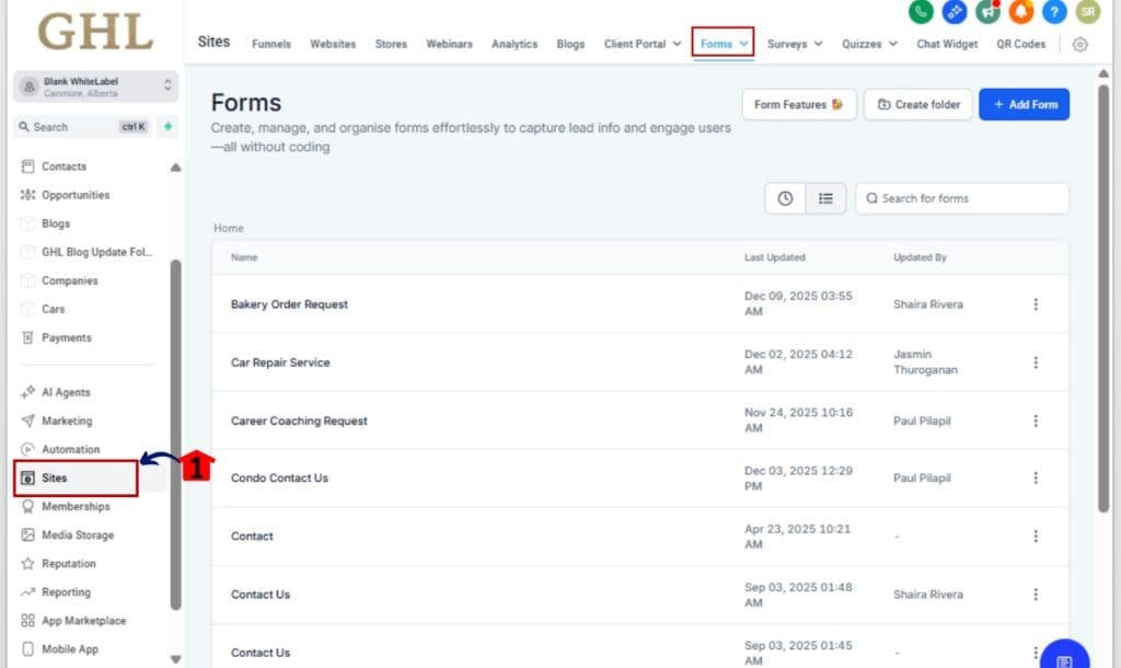
Step 01 – Open the Form Builder
1.1 From your GHL dashboard, click on Sites in the left-hand menu.
1.2 Select Forms, then click Builder.
Step 02 – Add or Select a Button Element
2.1 You can drag in a new button, or just click on one you’ve already placed.
2.2 The button settings will show up on the right side.
Step 03 – Enable the Icon Feature
3.1 Scroll to the new option labeled “Show Icon.”
3.2 Toggle it on to activate icon settings.
Step 04 – Pick an Icon Using the Sidebar
4.1 A searchable icon picker will now show up.
4.2 Just type a keyword (like arrow or checkmark) to pull up matching icons, or scroll through to see what catches your eye.
4.3 Click your desired icon to select it.
Step 05 – Set Icon Placement (Left or Right)
5.1 Choose the icon’s position, left side or right side of the label.
5.2 The builder shows the update immediately so you know exactly what you’re getting.
Step 06 – Preview and Save Your Form
6.1 Check the live preview to confirm your icon is aligned and looking good.
6.2 Hit Save Form in the top right to apply your changes.
That’s it. Your Form Button Icons just went from basic to branded, and your CTAs are now clearer, quicker, and conversion-ready.
Pro Tips – Best Practices for Button Icons
Now that your icons are set, let’s fine-tune things. Some quick adjustments can take your buttons from basic to buttoned-up and effective.
Here’s how to get the most out of form button icons in GHL:
1. Match the icon to the CTA
Your icon should reinforce the action the user is about to take. Examples:
- 📨 Paper plane for “Send”
- ✅ Checkmark for “Submit”
- 🗓️ Calendar for “Book Now”
- 🛒 Cart for “Buy” or “Order”
2. Don’t go overboard
No need to icon-up every Form Button Icons. Just use them where they make things clearer for the user.
3. Keep it universal
Avoid obscure or abstract icons. Stick with symbols that are easily recognized across industries and cultures.
4. Test on mobile
Make sure the icon doesn’t squish your text or break the layout on small screens. Test on mobile and tablet views inside the GHL preview or with a live link.
5. Watch contrast and color
Icons inherit your button’s font and style settings, so double-check the contrast and readability if you’re using dark backgrounds or vibrant colors.
6. Use icons to guide flow
If your form has multiple steps, use directional icons (like arrows or forward indicators) to help guide the user visually.
A great Form Button Icons feels effortless to click. These tips will help you design buttons that don’t just look great, but convert like crazy.
FAQs – Common Questions About Using Button Icons
What This Means – Agencies & White-Labeling
If you’re running a white-label SaaS or GHL agency, this tiny update is a big win for how you present your product.
Here’s why it matters:
1. You look more polished, without custom code
Before, making forms “look modern” meant editing CSS or calling a developer. Now, your Form Button Icons can instantly reflect clean UI standards with just a toggle.
2. Branded CTAs boost client perception
Want to match a brand’s visual identity? Use icons that align with their language and style. Even small things like a checkmark or arrow can make your agency’s output feel premium.
3. Better results = happier clients
Improved clarity means better UX. Better UX means more leads. And that means your clients will see better results—without needing a total form redesign.
4. You can use this as a feature add-on
Reselling SaaS? This gives you one more visual touchpoint to include in your packages, snapshots, or onboarding flows. “Custom-branded Form Button Icons” might sound small, but for design-sensitive clients, it’s gold.
5. Less time in support chats
Fewer custom code requests from clients = more time for strategy and sales.
This might seem like a small update, but it helps you work faster, impress clients, and close more leads, no tech skills needed.
Results You Can Expect – Conversion Boosts
It might not look like much, but adding an icon to your Form Button Icons can seriously boost how users respond, especially when every click counts.
Here’s what you can expect after implementing form button icons:
1. Higher Form Completion Rates
If people know exactly what a Form Button Icons does, they’re way more likely to hit it. A good icon clears up any confusion, especially on small screens.
2. More Professional-Looking Forms
A clean, icon-enhanced Form Button Icons instantly upgrades the visual style of your form. It looks like something a real designer built, not a stock template.
3. Improved User Experience
Icons guide users subconsciously. A download icon makes people expect a file. A calendar suggests an appointment. These cues make the form feel easier to use.
4. Less Drop-Off
Unclear CTAs lead to drop-offs. An icon reinforces the next step and gives that extra push users need to complete the form.
5. Faster Client Approvals
Agencies, take note: the difference between “This looks great!” and “Can we tweak this?” often comes down to little visual polish points. This is one of those.
You won’t need to wait weeks to see the impact. Try icons on a high-traffic form and watch how even that small tweak changes the user journey.
Conclusion – Small UI Tweak, Big Impact
In the world of online forms, every click counts. And now, with GoHighLevel’s new form button icons feature, you’ve got a simple way to make every CTA count even more.
This isn’t about flashy design. It’s about clarity, confidence, and conversion. With just a toggle and a few clicks, you can turn your Form Button Icons from “meh” to magnetic.
If you’re building funnels for clients or growing a SaaS brand, this simple update helps your forms look better without adding more work.
So what’s next?
Go into your highest-traffic form, turn on the icon toggle, and give that CTA a makeover. Because small changes like this? They stack up, and they help you win.
Scale Your Business Today.
Streamline your workflow with GoHighLevel’s powerful tools.