- Add clean button animations without custom CSS.
- Quick Summary – Button Hover Effects at a Glance
- What Changed with Button Hover Effects
- Why Button Hover Effects Matter
- How to Use Button Hover Effects in GHL
- Quick Tips for Better Button Hover Effects
- What Button Hover Effects Mean for Your Business
- Frequently Asked Questions About Button Hover Effects
- Better Buttons Without Custom CSS
Add clean button animations without custom CSS.
Button Hover Effects Improve Your CTAs
Button Hover Effects are now easier to add and control in GoHighLevel. You can choose from 21 built-in effects, preview them on the page, and adjust the settings without writing custom CSS.
Before this update, button hover options were basic and hard to customize. Now you can change the timing, color, size, distance, rotation, border, and shadow. The sidebar only shows the settings linked to the effect you choose, which keeps the process simple.
This gives agencies and page builders a faster way to create clear, responsive calls to action. A small grow, glow, or color change can make a button feel more active without making the page look busy.
Button Hover Effects help you create clearer, more responsive CTAs without custom CSS. You can preview each effect, adjust the settings, and build more polished pages in less time.
Quick Summary – Button Hover Effects at a Glance
Purpose: This update helps you add Button Hover Effects to GoHighLevel buttons without custom CSS.
Why It Matters: Clear hover feedback can make key buttons feel more responsive and easier to notice.
What You Get: You can choose from 21 effects, preview them live, and adjust timing, easing, color, movement, borders, and shadows.
Time to Complete: Most users can add and test a hover effect in about five minutes.
Difficulty Level: Beginner-friendly. No coding is required.
Key Outcome: Your buttons can look more polished while keeping the page clear and easy to use.
What Changed with Button Hover Effects
Button Hover Effects in GoHighLevel now give you far more control. Before this update, the builder only offered a few basic options, such as elevate and wobble. You could not adjust much, so custom CSS was often the only way to create a more polished effect.
You can now choose from 21 effects across six groups. These include scale, rotation, movement, background, border, and shadow effects. You can also preview each one on the page before you apply it, which makes it easier to compare options.
Automate marketing, manage leads, and grow faster with GoHighLevel.

The new controls let you adjust speed, delay, easing, color, size, distance, angle, border width, blur, and spread. GoHighLevel only shows the settings that match the effect you select, so the sidebar stays clean and easy to use.
Why Button Hover Effects Matter
Button Hover Effects give visitors a clear sign that a button is ready to click. That small response can make a page feel smoother and easier to use. It also helps key calls to action stand out without adding more text or clutter.
For agencies, this update removes a common design problem. You no longer need custom CSS to create a simple grow, glow, sweep, or shadow effect. That saves time, makes templates easier to manage, and gives more team members control over page design.
This is useful for booking buttons, lead forms, checkout pages, and special offers. A clean hover effect can help guide attention to the next step while keeping the page professional. The key is to keep it subtle, so the button feels active without becoming distracting.
How to Use Button Hover Effects in GHL
Button Hover Effects are managed inside the GoHighLevel Page Builder. In this guide, you’ll learn how to open a website page, select a button, choose a hover effect, adjust its settings, and publish your changes.
Here are the steps we will follow:
- Access your website in GHL.
- Open the page you want to edit.
- Open the Hover Animation settings.
- Choose a Button Hover Effect.
- Adjust and Publish the Hover Effect .
To start, make sure you are logged in to the correct GoHighLevel sub-account.
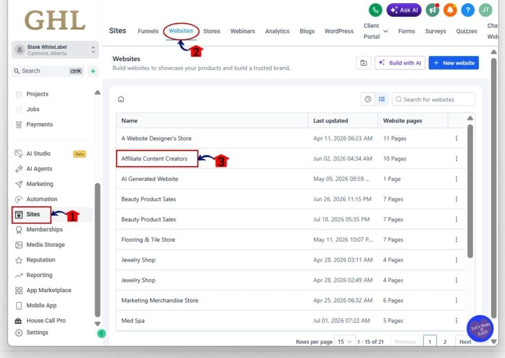
Step 01 – Access Your Website in GHL
- The main menu on the left side of your screen includes the main areas you use in GoHighLevel.
1.1 Click Sites.
- This opens the main Sites section.
1.2 Click Websites in the top menu.
- The Websites page will open and show the websites in your sub-account.
1.3 Click the name of the website you want to edit.
- The website dashboard will open.
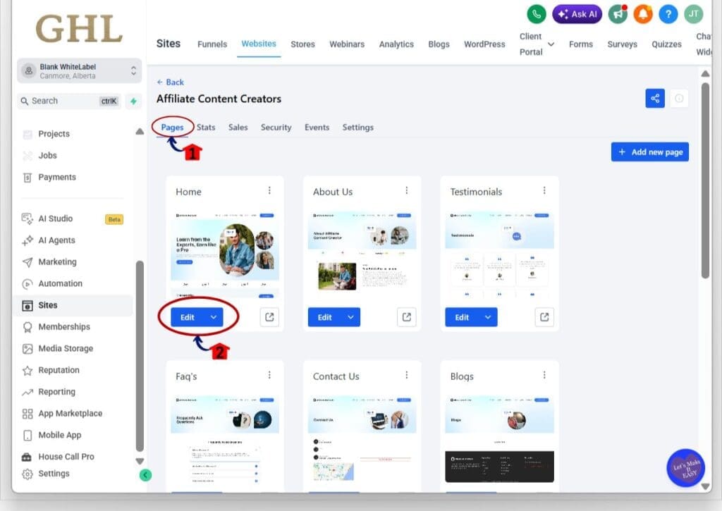
Step 02 – Open the Page You Want to Edit
- The website dashboard shows all pages linked to the selected website.
2.1 Click Pages.
- The website pages will appear below.
2.2 Click Edit on the page you want to update.
- The selected page will open inside the GoHighLevel Page Builder.
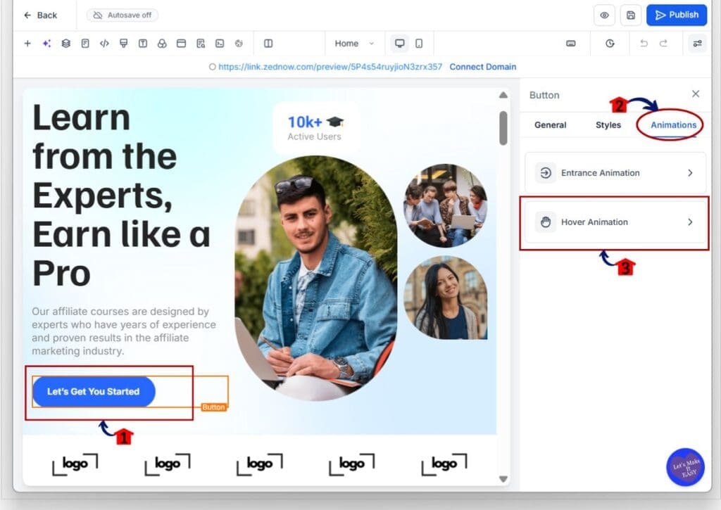
Step 03 – Open the Hover Animation Settings
- You can add Button Hover Effects after selecting the button you want to update.
3.1 Click the button you want to animate.
- The selected button will be outlined on the builder canvas.
- The button settings will open in the right sidebar.
3.2 Click Animations in the right sidebar.
- The available animation settings will appear.
3.3 Click Hover Animation.
- The Button Hover Effects library will open.
Step 04 – Choose a Button Hover Effect
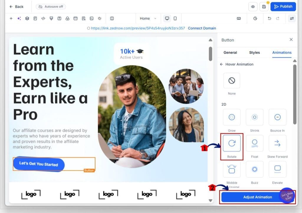
- The Hover Animation library includes several effects for changing how the button responds when a visitor moves their cursor over it.
4.1 Review the available Button Hover Effects.
- The options include effects such as Grow, Shrink, Bounce In, Rotate, Float, Skew Forward, Wobble, Buzz, and Elevate.
4.2 Hover over an effect card to preview it.
- The selected button will show the effect on the canvas before you apply it.
4.3 Click the effect you want to use.
- The chosen hover effect will be applied to the selected button.
4.4 Click Adjust Animation.
- The controls for the selected effect will open.
Step 05 – Adjust and Publish the Hover Effect
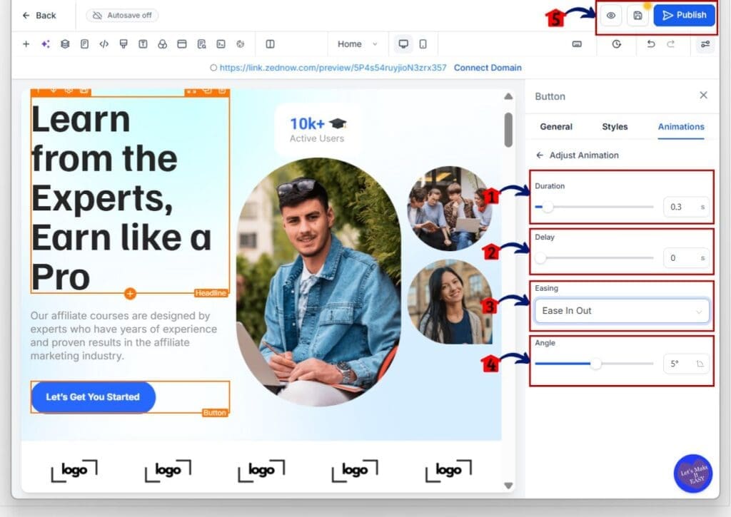
- The Adjust Animation panel lets you control the timing and movement of the selected effect.
5.1 Adjust the Duration.
- Choose how long the hover effect will take to complete.
- The duration can be set from 0.1 to 3 seconds.
5.2 Adjust the Delay.
- Choose how long GHL should wait before starting the effect.
- The delay can be set from 0 to 5 seconds.
5.3 Choose the Easing.
- Select one of the following options:
- Linear
- Ease In
- Ease Out
- Ease In Out
- The easing setting controls how the animation speeds up or slows down while it plays.
5.4 Adjust the effect-specific setting.
- The final control will change based on the Button Hover Effect you selected.
- For example, the Rotate effect includes an Angle control.
- Other effects may include settings for scale, distance, color, border thickness, blur, or spread.
5.5 Preview and publish the page.
- Hover over the button on the canvas to test the effect.
- Click the eye icon to preview the full page.
- Check that the motion feels smooth and does not distract from the page.
- Click Publish when the effect looks right.
Once the page is published, Button Hover Effects will respond when desktop visitors move their cursor over the button. Keep the movement simple and test the full page before publishing so the effect supports the call to action instead of pulling attention away from it.
Quick Tips for Better Button Hover Effects
Button Hover Effects work best when they make the next step clear. A small Grow, Glow, or Shadow effect is often enough for a main CTA. Keep it simple so the button feels active without pulling attention from the offer.
Use a short duration and smooth easing. In most cases, 0.2 to 0.5 seconds feels natural. You can also use the same effect on similar buttons, such as Book Now, Get Started, or Buy Now, to keep the page consistent.
Check the button color and text before you publish. The effect should improve contrast, not make the button harder to read. Also remember that hover effects do not show on touch devices or screens below 1024 pixels, so the button still needs to look clear on mobile.
What Button Hover Effects Mean for Your Business
Button Hover Effects can make your pages feel more polished without adding more work. Agencies can improve client websites, funnels, and landing pages from the builder without relying on custom CSS for every small design change.
They also help keep calls to action clear and consistent. You might use a Grow effect on booking buttons, a Glow effect on a main offer, or a simple background change on a checkout page. Small changes like these can make the next step easier to notice.
For teams that manage many pages, this update can save time and reduce design errors. You can set a clear style, reuse it across similar buttons, and keep the user experience steady from one page to the next.
Frequently Asked Questions About Button Hover Effects
Better Buttons Without Custom CSS
Button Hover Effects give GoHighLevel users a simple way to make buttons feel more clear and responsive. You can choose from 21 effects, preview them on the page, and adjust the timing and style from the builder.
The biggest win is control without extra code. You can add a small Grow, Glow, Rotate, or background effect in a few clicks, then test it before you publish. That makes it easier to improve CTAs across websites, funnels, and landing pages.
Start with one key button and keep the effect subtle. A clean hover state should support the next step, not distract from it. Which Button Hover Effect will you test first?
Scale Your Business Today.
Streamline your workflow with GoHighLevel’s powerful tools.