- Better browsing for GoKollab users
- Quick Summary – Key Takeaways for Community Course UX
- What Changed in GoKollab
- Why This Matters to You
- How to Use the Community Course UX Features
- Pro Tips for Better Community Course UX
- What This Means for Your Business
- Frequently Asked Questions
- Final Thoughts on the GoKollab Community Course UX
Better browsing for GoKollab users
If you’ve been using GoKollab for communities or courses, you’ve probably noticed it could be faster. Clicking around to find what you need sometimes feels clunky. This latest update aims to fix that with smoother community course UX.
GoHighLevel has added a few simple features that make a big difference. Now it’s easier to open content, move through carousels, and keep your most-used items within reach.
Whether you’re managing a white-labeled client portal or just want your course experience to feel more modern, these changes help things run better.
These updates improve community course UX by speeding up navigation, making content easier to access, and giving your clients a better experience across the board.
Quick Summary – Key Takeaways for Community Course UX
Purpose: This update makes it easier to move through GoKollab and find what you need faster.
Why It Matters: Better community course UX means less clicking around and a smoother experience for your clients.
What You Get: Quick double-click access, easier scrolling, pinned courses, a cleaner layout, and numbers that are easier to read.
Time to Complete: No setup needed. Just log in and use the new features.
Difficulty Level: Simple enough for anyone to use right away.
Key Outcome: You save time, your clients stay happy, and the whole platform feels easier to work with.
What Changed in GoKollab
GoKollab just got easier to use. These updates are focused on making community course UX smoother and more efficient. They’re not flashy, but they fix the small things that slow people down.
Here’s what’s new:
Automate marketing, manage leads, and grow faster with GoHighLevel.

- Double-click to open. You can now double-click a course or community to open it. No need to click through menus. Just tap twice and you’re in.
- Drag to scroll. If you’re on a desktop, you can drag your mouse to scroll through top sections like carousels. It feels more natural and saves time.
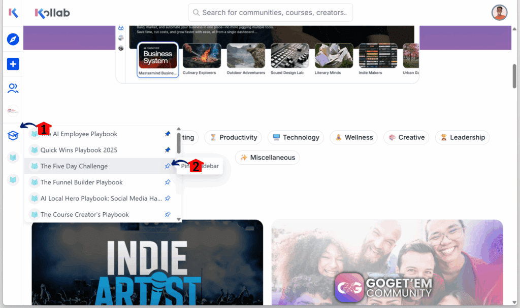
- Pin courses to the sidebar. You’ve been able to pin communities. Now you can do the same with courses. Just click the pin icon, and it stays in your sidebar under the 🎓 tab for quick access.
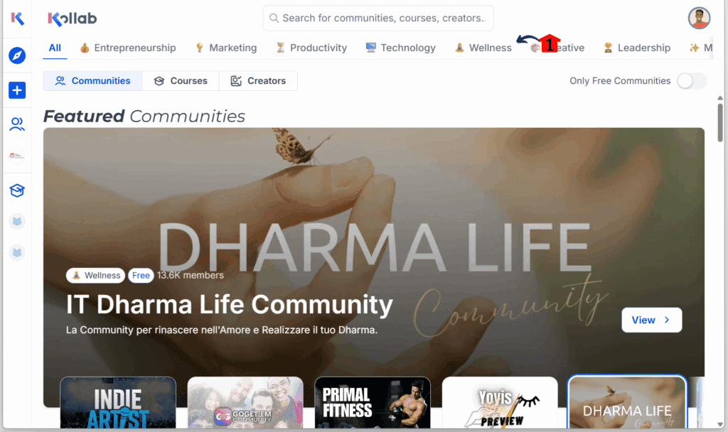
- Hero section layout fix. The hero section at the top of the page now lines up with the rest of the page. It’s a small visual change, but it makes the whole layout feel cleaner.
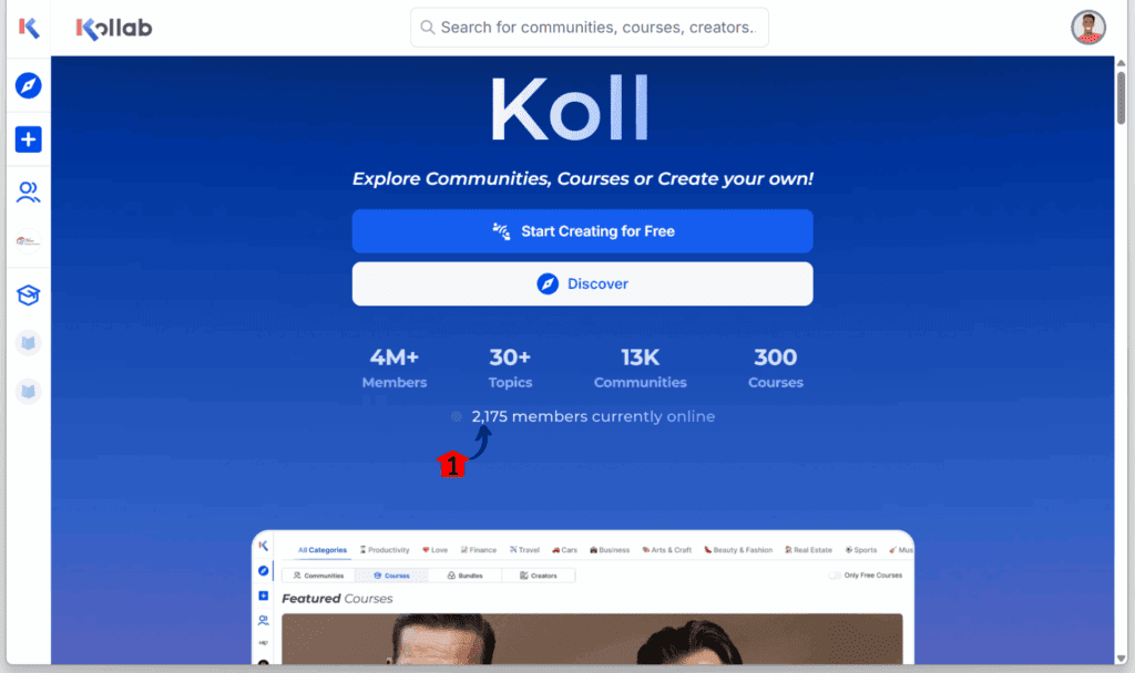
- Comma separators for big numbers. Numbers like 10000 now show as 10,000. This update makes large figures easier to read, especially when scanning analytics or enrollments.
These simple changes improve community course UX by helping users move faster, find what they need quicker, and work with fewer clicks.
Why This Matters to You
Good tools should be easy to use. These updates make GoKollab feel more natural, especially when you’re using it to run courses or manage communities. They’re simple changes, but they help you and your clients get around faster.
Double-clicking to open something may seem small, but it removes steps. That means less clicking, less guessing, and less explaining things to clients. The new drag-to-scroll makes browsing feel smoother too, especially on desktop.
Being able to pin courses to the sidebar is useful if you have a few you open all the time. You don’t need to hunt for them anymore. Just click and go.
Even the cleaner layout and the commas in large numbers improve the overall feel. It’s easier on the eyes and gives everything a bit more polish.
All together, these changes improve community course UX by helping people focus on what matters: learning, sharing, and getting work done.
How to Use the Community Course UX Features
If you’re working with GoKollab for your courses or communities, these updates will make things quicker and easier. But only if you know where to look and how to use them. This section walks you through each of the five new features one step at a time.
You won’t need to change any settings or install anything. Most of these updates are ready to go inside your account. From double-click shortcuts to pinned courses and better navigation, each step below is simple but helps improve the overall community course UX.
How to Do the Double-Click View
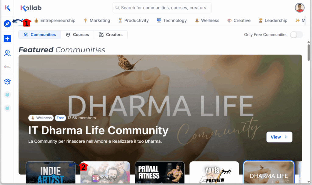
Step 01 – Access the Explore Dashboard
- Once you’re logged in to your GoKollab account, you should land on your dashboard.
1.1 Click the Explore icon/button.
- This is located at the upper left of the dashboard and looks like a compass.
- You should now be on GoKollab’s Explore dashboard.
1.2 Double-click any featured community thumbnail.
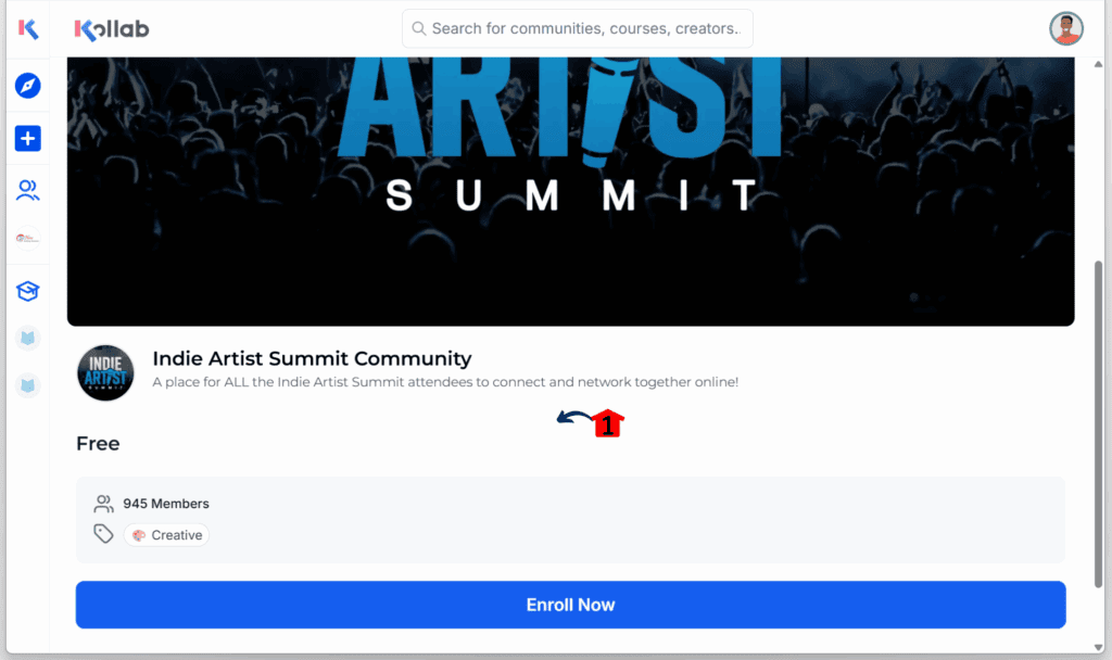
Step 02 – Open the Community Preview
- You should now see that specific community’s dashboard preview.
2.1 Explore the selected community.
How to Click and Drag Carousels
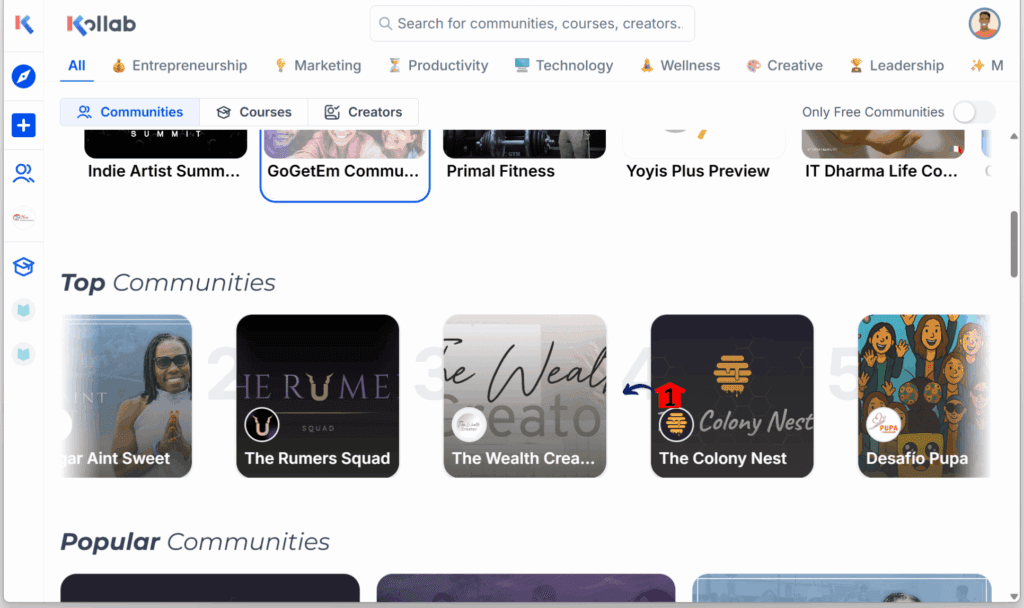
Step 01 – Browse Featured Communities
- You should be in the Explore dashboard, where featured communities are displayed in a carousel.
1.1 Scroll sideways through the featured communities carousel.
How to Pin a Community or Course
Step 01 – Navigate to the Community Tab
- You should be in your GoKollab dashboard.
1.1 Click the Community icon/button.
1.2 Hover over any community and click the pin icon on the one you want to save.
How to Check the Hero Section Alignment
Step 01 – Review Navigation Placement
- You should be in your GoKollab Explore dashboard.
1.1 Check if the items in the navigation menu are aligned properly with the page.
How to Check the Comma in a Number
Step 01 – Inspect Number Formatting
- You should be in your GoKollab dashboard.
1.1 Check if long numbers include a comma separator where appropriate.
Pro Tips for Better Community Course UX
These updates are already helpful, but a few smart habits can make them even more useful in your daily setup. Good community course UX isn’t just about the features, it’s also how you use them.
Clean up your sidebar
- Only pin the courses you use most often.
- Try to keep it to three to five items.
- Too many pins make it harder to find what you need quickly.
Teach the basics early
- When onboarding new clients or team members, show them how to double-click to open content.
- Show how to click and drag on desktop to scroll carousels.
- These small tips can help people feel more comfortable right away.
A cleaner community course UX and better number formatting make a difference. It helps your brand look more polished, especially if you’re offering a white-labeled client portal. Little details like this help your platform feel more stable and easier to use.
What This Means for Your Business
Good community course UX helps more than just your layout. It also makes your day smoother. When people can move around faster and find what they need, you spend less time answering questions or fixing confusion.
If you run memberships or sell online courses, this kind of update helps users stay focused. They’re not stuck trying to open a course or scroll through a messy layout. That keeps them engaged and less likely to drop off.
Here’s where you might see a difference:
- Fewer support messages asking how to find things
- Shorter onboarding time for new clients or staff
- A cleaner, more modern interface that shows you’re serious
- Better first impressions, especially on a white-labeled platform
These small changes are already live. You don’t need to adjust settings or teach people new tricks. The system just works better. And that gives your business one less thing to worry about.
Frequently Asked Questions
Final Thoughts on the GoKollab Community Course UX
This update to GoKollab doesn’t bring big new features, but it makes your daily work feel easier. With better community course UX, small tasks take less time and the whole platform feels more organized.
Being able to double-click to open content, pin your most-used courses, and scroll smoothly makes a real difference. These changes help you stay focused and give your clients a better experience too.
Take a few minutes to test the updates in your account. Show your team or clients how they work. These small fixes can save time and reduce confusion.
Have you tried the new community course UX setup yet? Let us know how it’s working for you. And check out more GHL updates here at GHL Growth Garage if you want to keep things running smooth.
Scale Your Business Today.
Streamline your workflow with GoHighLevel’s powerful tools.
