- Inline Editing UX on Small Screens
- Quick Summary – Inline Editing UX Essentials
- Settings Icon Now Controls Side-Tray
- Close the Tray, Keep Your Selection
- Better Editing Flow Across All Devices
- How to Use the New Side-Tray for Inline Editing UX
- Power User Tips for Inline Editing UX
- Inline Editing UX – FAQs
- What You’ll Notice Right Away
- Small Change, Big UX Win
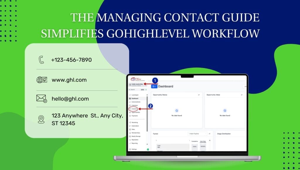
Inline Editing UX on Small Screens
You’re in the zone, building a form, clicking through fields, making updates, and then bam. The side-tray gets in your way. You close it to focus, but the builder forgets what you were editing. Now you’ve lost your place, and your workflow? Interrupted.
That kind of clunky workflow slows everything down. But GoHighLevel just dropped a slick update to fix that mess.
There’s now a simple fix to an old frustration: the side-tray only opens when you click the gear icon, and it won’t wipe your selection when you close it. It’s faster, cleaner, and just makes editing forms or surveys feel more in control.
This side-tray update gives you complete control over editing elements without losing your place. With improved inline editing UX, you’ll move faster, especially on smaller screens.
Quick Summary – Inline Editing UX Essentials
Purpose: This update gives users full control over the side-tray in Forms, Surveys, and Quizzes, improving the inline editing UX, especially on mobile and smaller screens.
Why It Matters: Previously, the tray would open and close automatically, often deselecting your item and breaking your workflow. Now, your selection remains active, even when you close the tray.
What You Get: A dedicated settings icon now controls the tray. This means you can open it when needed and close it anytime without resetting your progress.
Time To Complete: You can start using this immediately, no setup required. Just open a form or survey and begin Inline Editing UX with the gear icon.
Difficulty Level: Beginner-friendly. If you’ve used GHL’s builders before, this new behavior will feel natural, and easier.
Key Outcome: Faster, smoother Inline Editing UX with fewer clicks and better mobile usability. Your team and clients will feel the difference instantly.
Settings Icon Now Controls Side-Tray
Here’s the big change: you no longer need to fumble with an automatic side-tray that opens every time you click an element. GoHighLevel has introduced a dedicated settings icon, a clean, clickable gear that appears only when you need it.
Tap on a field and you’ll notice a gear icon right on it. One click brings up the settings tray. Close it whenever you want—your focus stays locked on the same field.
Automate marketing, manage leads, and grow faster with GoHighLevel.

If you’re the type who builds fast or works from a laptop, this change is going to make things feel way smoother.
So what’s new, at a glance:
- Settings are now accessed through a visible icon, not auto-triggered.
- You decide when the tray opens, giving you more screen real estate to work with.
- The new setup works the same way in the form builder, survey builder, and quiz builder.
It’s intuitive, tidy, and gives you more control than ever.
Close the Tray, Keep Your Selection
Before this update, Inline Editing UX felt like a battle between precision and patience. You’d select a form field, the side-tray would pop open, and if you closed it to get a better view? Poof, your selection was gone. You had to click the element all over again to make more changes.
Not anymore.
Now, when you close the side-tray using the new settings icon, your selection remains active. That means you can:
- Review your layout without reselecting anything
- Make quick edits, then minimize distractions
- Switch focus between design and settings without losing context
This small shift dramatically improves the Inline Editing UX workflow, especially for users who work fast or bounce between fields frequently.
The result? Fewer clicks. Less repetition. More flow.
Better Editing Flow Across All Devices
Let’s be real: building forms and surveys inside a side-tray-heavy editor wasn’t always smooth, especially on laptops, tablets, or phones. Too often, the editing tray got in the way of the actual content you were trying to tweak.
This update solves that.
Here’s why this matters for your daily workflow:
- Less tray, more room. Close it when you don’t need it and give yourself more space to work.
- Less cognitive friction. You stay focused on your content without having to reselect elements or remember what you were editing.
- Improved mobile builder UX. GHL builders are more responsive than ever. This change finally catches the tray behavior up to that standard.
- You won’t lose your place anymore, which means fewer repeated actions and a faster workflow.
It’s a win for speed, clarity, and user control, especially for busy agency teams juggling multiple builds.
How to Use the New Side-Tray for Inline Editing UX
If you’ve ever closed the tray and had to hunt down your last edit, good news. Now you decide when to open or close the panel, and your field stays selected. Here’s how to use the new setup for smoother editing across all screen sizes.
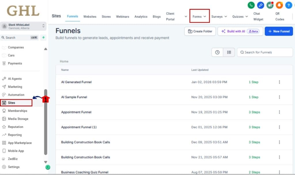
Step 01 – Open the Builder
1.1 Go to your GHL dashboard.
1.2 Open the “Sites” menu and choose between Forms, Surveys, or Quizzes.
1.3 Click into the specific item you need to update in the builder view.
Step 02 – Select Any Element
2.1 Add a new field or pick one that’s already in the layout.
2.2 Look for the gear icon to show up on that element.
Step 03 – Click the Settings Icon
3.1 Click the gear icon to open the side-tray.
3.2 The side-tray will slide in from the right, displaying all settings for that element.
Step 04 – Edit Field Settings as Needed
4.1 Update field label, placeholder text, required toggle, etc.
4.2 Scroll for advanced options like conditional logic or custom styles.
Step 05 – Close the Tray Without Losing Your Spot
5.1 Close the tray by clicking the X or tapping the gear icon again.
5.2 Your selected field will still be active, no extra clicks needed.
Step 06 – Repeat or Preview Your Changes
6.1 Continue editing the next element using the same method.
6.2 Use the mobile preview toggle to test your layout across devices.
That’s it. You now have complete control of your side-tray, making editing forms, surveys, and quizzes faster, easier, and less frustrating.
Power User Tips for Inline Editing UX
With the new tray in place, here are a few ways to streamline your process even more, great if you’re working quickly or handling complex forms.
Use the Tray Intentionally (Don’t Let It Distract You)
Before, the tray was always there, even when you didn’t want it. Now you’re in control. Open it only when you need it, and keep your layout clear while designing.
Edit Faster with Element-First Thinking
Build your structure first, then come back and tweak settings. With the tray now tied to a click, you can batch-edit fields without losing flow.
Optimize for Mobile Screens
Pair this new tray control with the mobile view toggle. You’ll be able to test spacing, label lengths, and screen fit without tray clutter getting in your way.
Use with Snapshots or Templates
If you reuse surveys or quizzes via Snapshots, this update makes bulk editing faster, just pop open settings per field, update, close, repeat.
Train Clients or Team Members on the Icon
White-labeling? Show your clients or junior team members the gear icon flow. It’s a simple training win that makes them feel more confident inside the builder.
Inline Editing UX – FAQs
What You’ll Notice Right Away
You won’t realize how helpful this is until you use it. From lead-gen to onboarding forms, this tray update makes building a whole lot easier.
Faster Editing, Fewer Clicks
No more double-clicking, reselecting, or fumbling with tray toggles. Just open, tweak, and move on, without breaking your flow.
Better Mobile Usability
This is a huge win for users building on smaller screens or laptops. You get full visibility without losing access to settings.
Cleaner Canvas = Clearer Thinking
Having the tray out of your way while designing gives you space to think, plan, and build smarter forms.
More Confidence for Clients or New Users
Whether you’re building for yourself or white-labeling for clients, this behavior feels intuitive. No need for training videos just to show someone how to edit a field.
Greater Speed Across Teams
Agencies with multiple users will love this. It helps everyone, from VAs to techs, work more efficiently without second-guessing where settings live.
In short: this update gives your editing flow a speed boost without changing how your forms work.
Small Change, Big UX Win
Sometimes all it takes is a tiny improvement to seriously boost your workflow, and this one does just that.
GoHighLevel finally gives you full control over the side-tray, so editing forms, surveys, and quizzes feels smoother and less annoying. No more pop-ups or lost selections getting in your way.
Now you decide when to open the tray and when to close it, without breaking your editing flow.
If you’re an agency owner, power user, or builder juggling multiple accounts, this is one of those quality-of-life wins that quietly saves you time every single day.
Try it out. Get used to the new gear icon. And enjoy the smoother Inline Editing experience, especially on the go.
Scale Your Business Today.
Streamline your workflow with GoHighLevel’s powerful tools.