- Why the Modern Form Design Update Matters
- Quick Summary – Modern Form Design
- Here are this weeks HighLevel Updates
- What’s New in the Modern Form Design Update
- What Changed with the Modern Form Design
- Why the Modern Form Design Update Matters
- How to Use the Modern Form Design Update
- Pro Tips for the Modern Form Design Update
- What the Modern Form Design Update Means
- Modern Form Design Update FAQs
- Final Thoughts on the Modern Form Design Update
Why the Modern Form Design Update Matters
GHL Modern Form Design used to need more tweaking than they should’ve. If you’ve ever built a Modern Form Design, survey, or quiz inside GoHighLevel, you know the real work wasn’t adding the fields.
It was fixing how everything looked. Spacing felt off. Inputs didn’t always feel consistent. Payment sections needed polishing. Empty states looked… empty. It worked. But it didn’t always feel modern.
And when you’re building assets for clients, “it works” isn’t the standard.
It has to look sharp. The Modern Form Design Update fixes that problem at the foundation level.
Instead of manually styling every detail, the new default theme now gives you cleaner fonts, better spacing, rounded corners, smarter input styling, improved payment components, and clearer empty states right out of the box.
No patch jobs. No over-customizing just to make it look professional.
For agencies cranking out funnels and payment forms, this removes a bunch of small annoyances that used to slow you down. Less fiddling with spacing. Less second-guessing how it looks. More confidence when clients see it.
What used to feel “good enough” now feels tight.
The latest GoHighLevel Changelog includes several other GHL feature updates that round out your daily workflow:
- New QR Code Styling Options: Shapes, Borders, and Rim Text
- Collapse & Resize Pipeline Stages in Kanban View
- Notes just got smarter for the contacts page!
- New Asana actions in workflows – Find Project and Find section
- Email AI + Knowledge Base Integration 🚀
- Dialer: Auto-minimize, Pin & Drag
- Schema Markup Using AI
Keep reading for much more on all these updates and a deep dive into the Calendar Validation Errors feature!

Quick Summary – Modern Form Design
Purpose: The Modern Form Design Update refreshes the default styling for forms, surveys, and quizzes inside GHL to create a cleaner and more professional user experience.
Why It Matters: A modern form layout builds trust faster, reduces user confusion, and improves the overall perception of your funnels and brand.
What You Get: Updated fonts, better spacing, improved input styling, redesigned file uploads, stronger payment sections, smarter date and signature fields, and clearer empty states.
Time to Complete: Creating and launching a new form with the updated design takes just a few minutes since the improvements are applied automatically.
Difficulty Level: Beginner-friendly. The Modern Form Design Update works out of the box with no complex configuration required.
Key Outcome: Faster launches, better user experience, stronger trust signals, and a more premium look across all your GHL forms.
Here are this weeks HighLevel Updates
New QR Code Styling Options: Shapes, Borders, and Rim Text
What it does:
Lets you stop using boring QR codes. You can now tweak the shape, style the border, and add text around the edge.
Where in GHL:
Accessible via Sites → QR Codes and within QR tools embedded in Funnel and Website builders.
Automate marketing, manage leads, and grow faster with GoHighLevel.

Impact:
Improves visual presentation and brand alignment while increasing scan appeal.
Best suited for:
Agencies that care about branding, small businesses running local promotions, online stores, and teams pushing QR campaigns.
Collapse & Resize Pipeline Stages in Kanban View
What it does:
Lets you hide pipeline stages you’re not actively using and adjust column widths so your board fits the way you work.
Where in GHL:
Inside Opportunities when you’re viewing your pipeline in Kanban mode.
Impact:
No more dragging your screen forever just to find the deals that matter.
Best suited for:
Owners running multi-stage pipelines, reps working deals every day, and anyone fed up with a messy board.
Notes Just Got Smarter for the Contacts Page
What it does:
Upgrades the notes area so it’s easier to write, review, and keep things organized inside a contact record.
Where in GHL:
Found directly within each contact’s profile under Notes.
Impact:
Makes it simpler to see what’s been discussed and who added what — without digging through clutter.
Best suited for:
Teams collaborating on accounts and businesses that document every client touchpoint.
New Asana Actions in Workflows – Find Project & Find Section
What it does:
Lets your workflow check what already exists in Asana before adding anything new.
Where in GHL:
Go to Workflows, add an action, and choose the Asana integration.
Impact:
No more duplicate projects. No more messy task boards. Just cleaner automation.
Best suited for:
Operations teams and agencies that rely on Asana to manage client delivery.
Email AI + Knowledge Base Integration
- What it does:
Allows Email AI to reference your Knowledge Base for smarter, more accurate responses. - Where in GHL:
Found in Conversations → Email composer with AI enabled and Knowledge Base settings under AI configuration. - Impact:
Smarter email suggestions that understand your business and help you reply quicker. - Best suited for:
Support teams, agencies managing inboxes, and businesses scaling communication with AI.
Dialer: Auto-Minimize, Pin & Drag
- What it does:
Lets you auto-minimize the dialer during calls, pin it in place, and drag it anywhere on screen. - Where in GHL:
Found in Conversations → Dialer. - Impact:
Cleaner workspace and easier multitasking during sales or support calls. - Best suited for:
Sales teams, outbound callers, appointment setters, and agencies making daily calls.
Schema Markup Using AI
- What it does:
Generates structured schema markup automatically using AI for SEO enhancement. - Where in GHL:
Found in Sites → Website or Funnel settings within AI or SEO sections. - Impact:
Improves search visibility without manual coding. - This works well for:
Teams building websites that need stronger search visibility, from agencies to small local businesses.
What’s New in the Modern Form Design Update
The Modern Form Design Update isn’t just a small style tweak. It’s a full refresh of the default theme across Forms, Surveys, and Quizzes inside GHL.
Here’s what’s new.
First, the default look has been completely cleaned up. Fonts are sharper. Spacing is more balanced. Corners are rounded. Everything feels more modern and aligned with current UI standards. New forms now look polished without needing extra styling work.
Input fields also feel better.
Checkboxes, radio buttons, and monetary fields now look more consistent. They don’t feel like separate pieces stitched together. They feel unified. That matters when users are moving quickly through a form.
The file upload field got a serious upgrade.
Now it clearly shows supported file types. It displays upload size limits. The icons are improved. You can even configure the header text. That means less confusion for users and fewer support questions for you.
The collect payment component looks stronger too.
Better styling. Clearer empty states. Configurable header text. And a direct “Add Product” option built in. This makes payment collection inside forms feel intentional, not bolted on.
Date and signature fields also improved.
Date placeholders now adjust automatically based on the selected format. Signature fields now allow custom placeholder text. Small details — but they make the experience feel smarter.
Even empty states are clearer.
Instead of blank screens when content is removed, GHL now provides better visual guidance. That helps prevent confusion while building.
And finally, overall theme consistency has improved. Images, labels, placeholders, chips, and footer colors now match better across the board. The entire experience feels cohesive.
This is what the Modern Form Design Update really does. It makes everything feel finished.
What Changed with the Modern Form Design
Before the Modern Form Design Update, most forms inside GHL worked fine. But they didn’t always feel polished.
The structure was solid. The functionality was there. But visually, you often had to adjust spacing, tweak fonts, or fine-tune styling just to make things look client-ready.
That’s the real shift here. The Modern Form Design Update moves quality from “customized” to “default.”
Previously, the default theme looked basic. Now it looks intentional. The spacing feels balanced. The alignment feels cleaner. Inputs feel unified instead of slightly mismatched.
Payment sections are a big example. Before, they worked. But they didn’t always feel visually integrated with the rest of the form. Now they match the overall theme and feel like part of the experience, not an add-on.
Empty states also changed. Instead of blank screens that made you double-check whether something broke, you now get clearer guidance. That reduces friction inside the builder and makes setup more predictable.
Date and signature fields also feel smarter. Auto-updating date placeholders remove confusion. Custom signature placeholders add flexibility. These are small details, but they remove awkward moments for end users.
Overall, the Modern Form Design Update doesn’t reinvent forms. It refines them.
It removes the little design annoyances that slowed you down. It reduces the need for manual polish. And it gives agencies a cleaner starting point every time they create a new asset.
Why the Modern Form Design Update Matters
The Modern Form Design Update isn’t just about looks. It’s about trust.
When someone lands on your form, they decide fast if it feels safe to fill out. Clean spacing. Clear inputs. Modern styling. These small visual signals tell people your business is organized and credible.
That directly impacts conversions. If your form looks outdated or cluttered, users hesitate. If it feels polished and easy to follow, they move forward.
That’s where this update wins.
For agencies, this means less design cleanup before sending funnels to clients. New forms already look professional. You don’t have to manually adjust every corner radius or font pairing just to make it feel current.
For marketers, it means smoother user flow. Clearer file upload sections reduce confusion. Improved payment styling builds confidence during checkout. Smarter date and signature fields reduce errors. Better empty states prevent builder mistakes.
It also saves time. Instead of fixing design inconsistencies, you can focus on strategy. Copy. Offers. Automation. The things that actually grow revenue.
And if you’re running SaaS Mode or white-labeling GHL? This makes your platform feel more premium without extra work.
The Modern Form Design Update quietly upgrades the experience for both builders and end users. Less friction. Better clarity. Stronger first impressions.
That’s not cosmetic. That’s leverage.
How to Use the Modern Form Design Update
The Modern Form Design Update is already active on all new forms, surveys, and quizzes you create inside GHL. You don’t need to enable anything, but you do need to understand how to use the updated components correctly.
In the steps below, you’ll access the builder, create or edit a form, configure updated elements like file uploads and payment sections, and test everything before publishing. Follow the process carefully so you can launch clean, professional forms without missing key settings.
- Create a New Form Using the Updated Default Theme.
- Add Fields to Your Form Builder.
- Customize Updated Components for File Upload.
- Customize Updated Components For Date Picker.
- Customize Updated Components For Signature.
- Preview and Save The Form Builder.
To start, make sure you are logged in to your GoHighLevel sub-account.
Step 01 – Create a New Form Using the Updated Default Theme
- In this step, you will access the builder and create a new form that automatically uses the updated default styling.
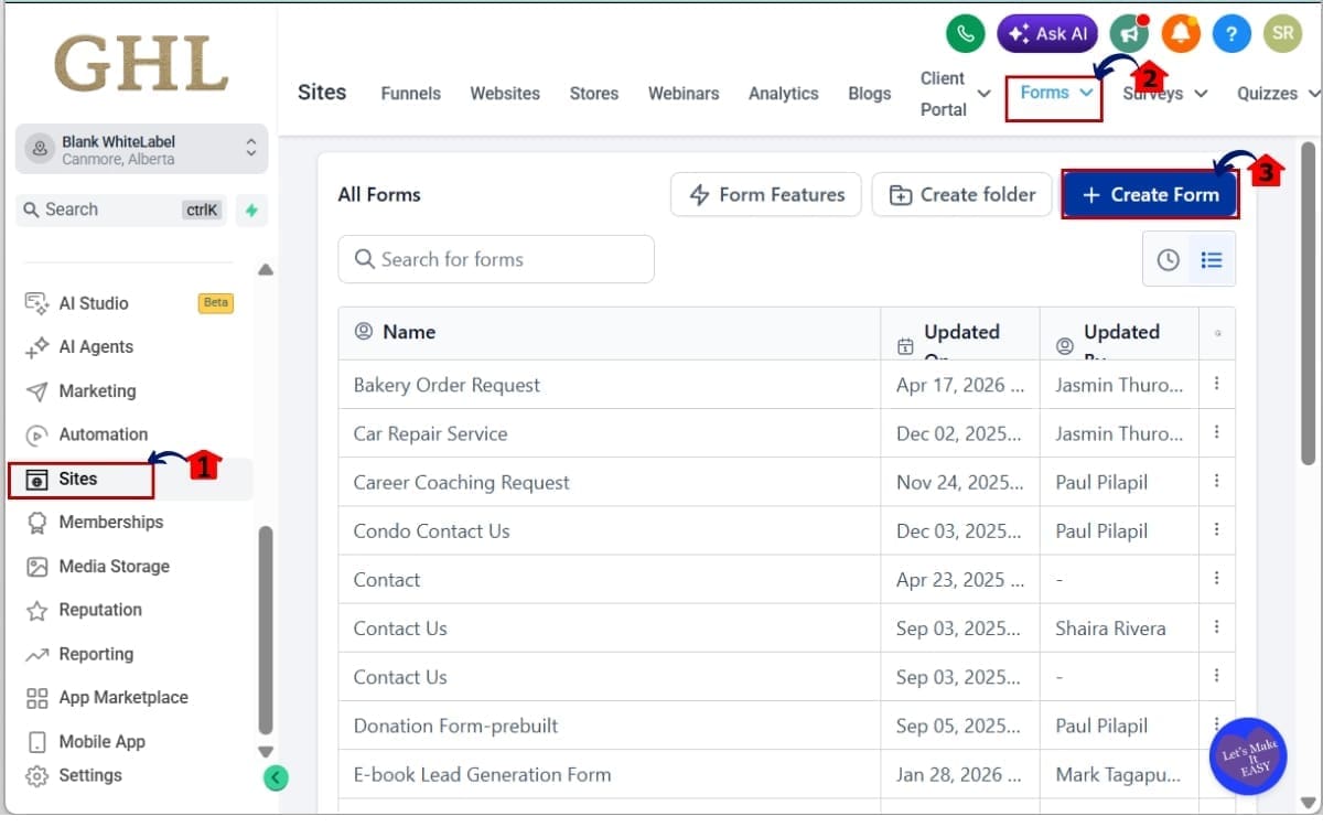
1.1 Go to the main left-hand menu. Click on “Sites.”
- The “Sites” section is where you manage funnels, websites, forms, surveys, and quizzes.
1.2 From the top navigation, click on:
- Forms
- Or Surveys
- Or Quizzes
- Choose the builder you want to work in. For this example, select “Forms” to open the Forms dashboard where the Modern Form Design Update is active.
1.3 Click the “Create New Form” button.
- This opens a blank form canvas that already includes the updated default theme with improved spacing, inputs, and styling.
Step 02 – Add Fields to Your Form Builder
- In this step, you will add the core fields to your form so you can see the updated styling and layout improvements in action.
2.1 Add your form fields:
- Click “Add Form Element” and begin inserting the required fields into your form layout. Add the following fields:
- Name
- Phone
- File Upload
- Date Picker
- Signature Field
- These fields allow you to test both standard inputs and the newly enhanced components included in the update.

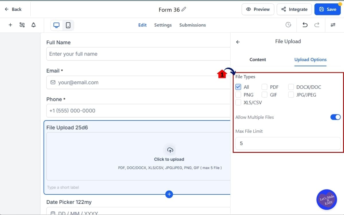
Step 03 – Customize Updated Components for File Upload
- In this step, you will configure the File Upload field settings to control what users can submit and ensure the instructions are clear.
3.1 Configure the File Upload Field
- Adjust supported file types if needed.
- Review upload size limits.
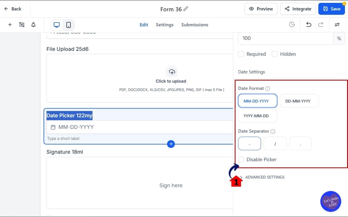
Step 04 – Customize Updated Components For Date Picker
- In this step, you will adjust the Date Picker settings to ensure the format is clear and matches your business or regional requirements.
4.1 Adjust Date Field Settings
- Select your preferred date format.
- Notice how the placeholder automatically updates.
This helps prevent format confusion for users.
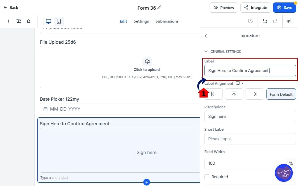
Step 05 – Customize Updated Components For Signature
- In this step, you will configure the Signature Field settings to make the signing process clear and user-friendly.
5.1 Update Signature Placeholder Text
- Customize the placeholder text.
Example: “Sign Here to Confirm Agreement.”Clear instructions improve completion rates.
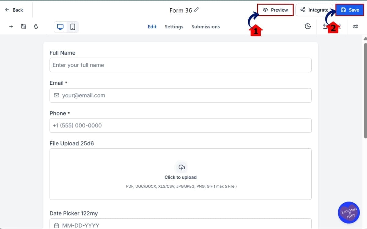
Step 06 – Preview and Save The Form Builder
- In this step, you will test your form to ensure all updated components function correctly before making it live.
6.1 Click the “Preview” button. Then test.
- Use Preview mode to experience the form exactly how a user will see it.
6.2 Click “Save”
- After confirming everything works properly, click Save to lock in your changes before embedding or publishing the form.
The Modern Form Design Update does most of the visual heavy lifting for you. Your job now is to focus on clarity and strategy.
Pro Tips for the Modern Form Design Update
It looks better. No question. But don’t stop there — you can still make it pull more weight for you.
First, don’t over-customize too fast. The new default styling is designed to look clean out of the box. Before changing fonts, spacing, or colors, preview it as-is. Many times, it already looks professional enough to launch.
Second, use header text strategically. The updated file upload and payment sections now allow configurable header text. Use that space to remove confusion.
Instead of: “Upload File”, Say: “Upload Your Signed Contract (PDF Only)”
Clear instructions reduce hesitation.
Third, simplify your payment sections. With the improved collect payment styling, you don’t need extra design blocks around it. Let the component breathe. Keep distractions low. Fewer elements mean higher focus during checkout.
Fourth, use empty states intentionally. The improved empty states make the builder clearer. But don’t leave large gaps in live forms. If you remove sections, double-check layout spacing before publishing.
Fifth, test mobile every time. The Modern Form Design Update improves responsiveness, but your field order and content length still matter. Long instructions can crowd smaller screens. Keep labels short and direct.
Keep your branding light. Drop in your primary color and logo, but don’t stack on design layers just because you can. Clean wins.
Common Mistakes to Avoid:
- Overloading forms with too many fields
- Adding unnecessary design elements around payment sections
- Ignoring file upload size limits
- Forgetting to preview on mobile
- Writing unclear placeholder text
The Modern Form Design Update gives you a stronger foundation. Your job is to keep it simple.
What the Modern Form Design Update Means
The Modern Form Design Update is more than a cosmetic refresh. It changes how fast you can launch.
Before, you might spend 20–30 minutes adjusting styling just to make a form look client-ready. Tweaking padding. Adjusting headers. Making payment sections feel clean.
Now? You start closer to the finish line.
For agencies, this means faster deployment. When you’re building funnels for clients, every minute matters. Cleaner default styling means less back-and-forth. Less explaining why something “will look better once we tweak it.” It already looks professional.
For SaaS resellers, this increases perceived value. If you’re white-labeling GHL, your sub-accounts now see modern, polished forms by default. That elevates your platform instantly. It feels premium without you lifting a finger.
For marketers running paid traffic, this improves trust signals. A clean form reduces hesitation. Better input styling makes completion easier. Improved payment sections increase confidence during checkout. That directly impacts conversion rates.
For coaches and consultants collecting payments through forms, this simplifies the buying experience. When the payment component feels integrated and professional, fewer users second-guess entering their card details.
Even internal workflows improve. Clearer empty states reduce setup mistakes. Smarter placeholders reduce confusion. Consistent styling lowers friction for your team when building assets.
Real-World Application Example: Imagine launching a lead generation funnel for a local service client.
You:
- Build a landing page
- Add a form with file upload
- Include a deposit payment
Before, you might spend time cleaning up the design.
Now, the Modern Form Design Update handles most of that automatically.
You focus on messaging. On offer positioning. On automation. That’s where growth happens.
This update doesn’t just make forms prettier. It removes small inefficiencies that add up across every build.
Modern Form Design Update FAQs
Final Thoughts on the Modern Form Design Update
The Modern Form Design Update isn’t flashy. It’s foundational.
It takes something you use every week inside GHL — forms, surveys, and quizzes — and makes them feel cleaner, smarter, and more professional by default.
No heavy redesign work. No endless spacing tweaks. No patching payment sections to make them look acceptable. Just better structure right out of the gate.
If you’re an agency, you’ll build faster and deal with fewer “can we tweak this?” emails. If you resell GHL, your white-label setup just feels more polished. And if you’re running traffic or collecting payments, the whole experience feels smoother from start to finish.
Small UX improvements compound. Cleaner inputs reduce confusion. Clearer file upload instructions reduce support requests. Better payment styling increases checkout confidence.
This is how platforms mature. Quiet improvements that make everything feel tighter.
If you haven’t created a new Modern Form Design yet, go build one. Test the file upload field. Add a payment product. Preview it on mobile.
You’ll feel the difference. Have you tested the Modern Form Design Update yet?
Let us know how it’s working inside your funnels — and check back to the GHL Growth Garage blog for more GoHighLevel feature breakdowns and tactical guides.
Scale Your Business Today.
Streamline your workflow with GoHighLevel’s powerful tools.